
Project duration:
July 2022 - August 2022
My Role:
Graphic Designer, UX Designer, Visual Designer, Motion Designer and Research
My Responsibilities:
User Research, wireframing, prototyping low-fidelity and high-fidelity prototypes, user testing, user interface, and usability study
Software Using:
Adobe XD
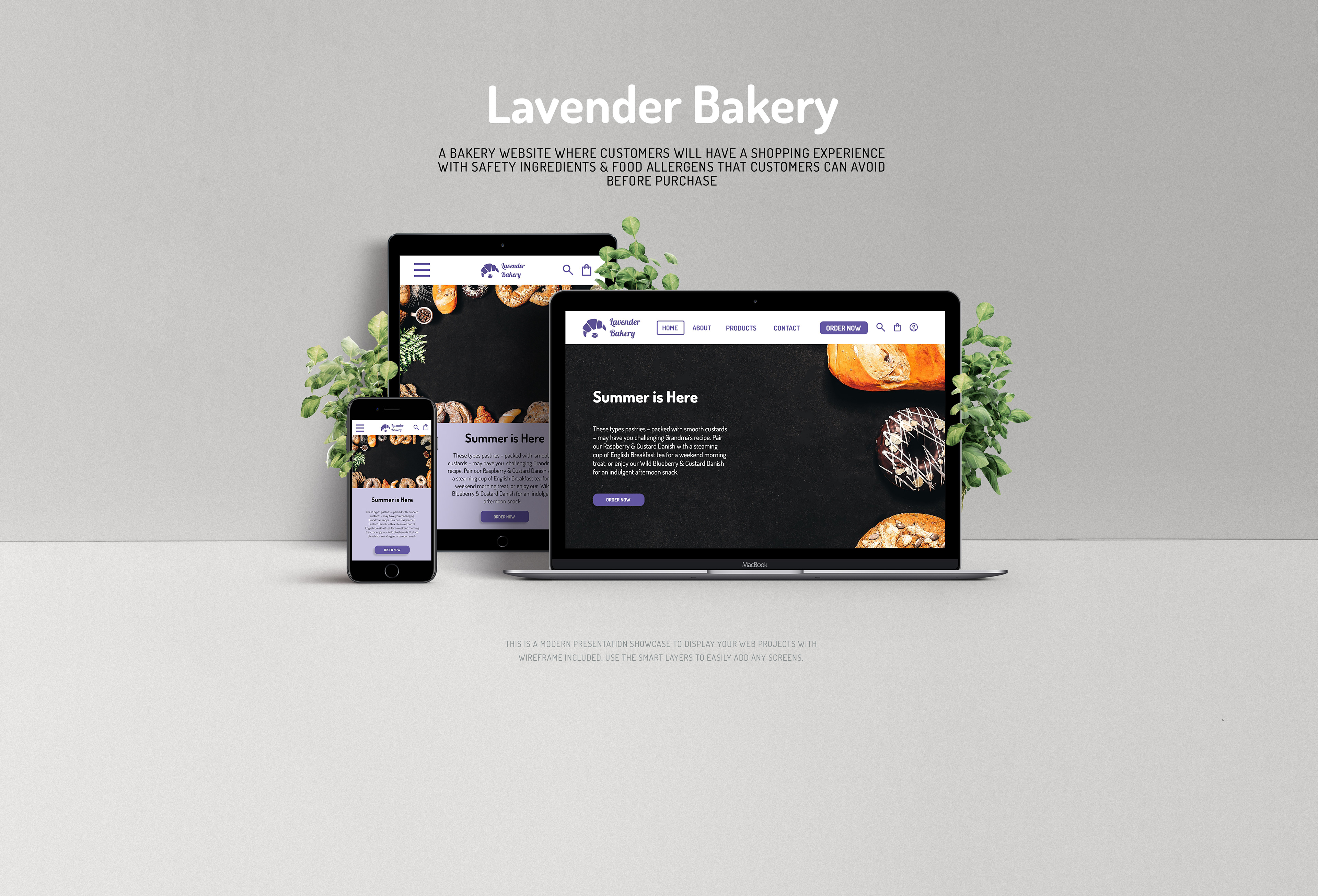
About the App
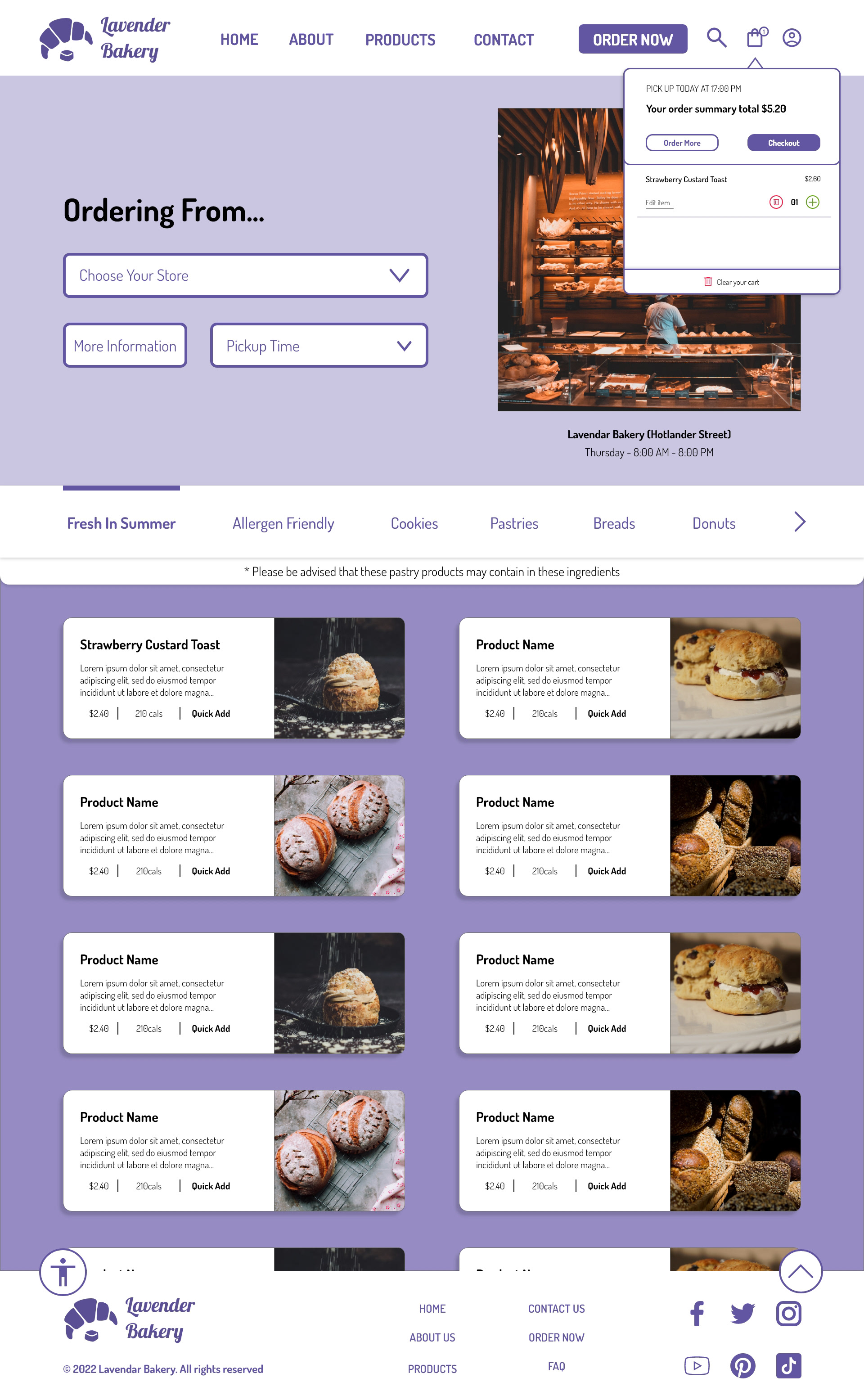
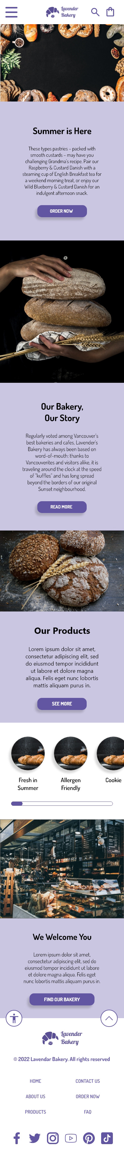
Lavender Bakery is a bakery shop where customers will have a shopping experience on the bakery website with safety-like ingredients and allergens that customers can avoid
User Research: Summary
I conducted interviews, and surveys, then I built
problem statements and ideas on how to resolve the participants’ problems.
problem statements and ideas on how to resolve the participants’ problems.
A few of my participants had a hard time and were confused when the pastries they tried to purchase were not included in the list of ingredients and contained allergens because of their safety allergies.
On the other hand, one of my participants told me that he wouldn’t know how long the pastry would be finished before he got there. So, he needed the time to know when it finish before his order was cold
User Pain Points:
1) Ingredients & Contained Allergens - The users won’t know if the pastries they purchased are contained allergens and the description of ingredients that the pastry had
2) Updated Photos - Some users may want to see what kind of pastry are they purchasing unless there are updated pastry pictures they want to look at
3) Countdown Timer - Most of the users want to how long will their order will be finished and the time from their location to the bakery store to pick up their orders while their orders are hot
User Persona & User Journey
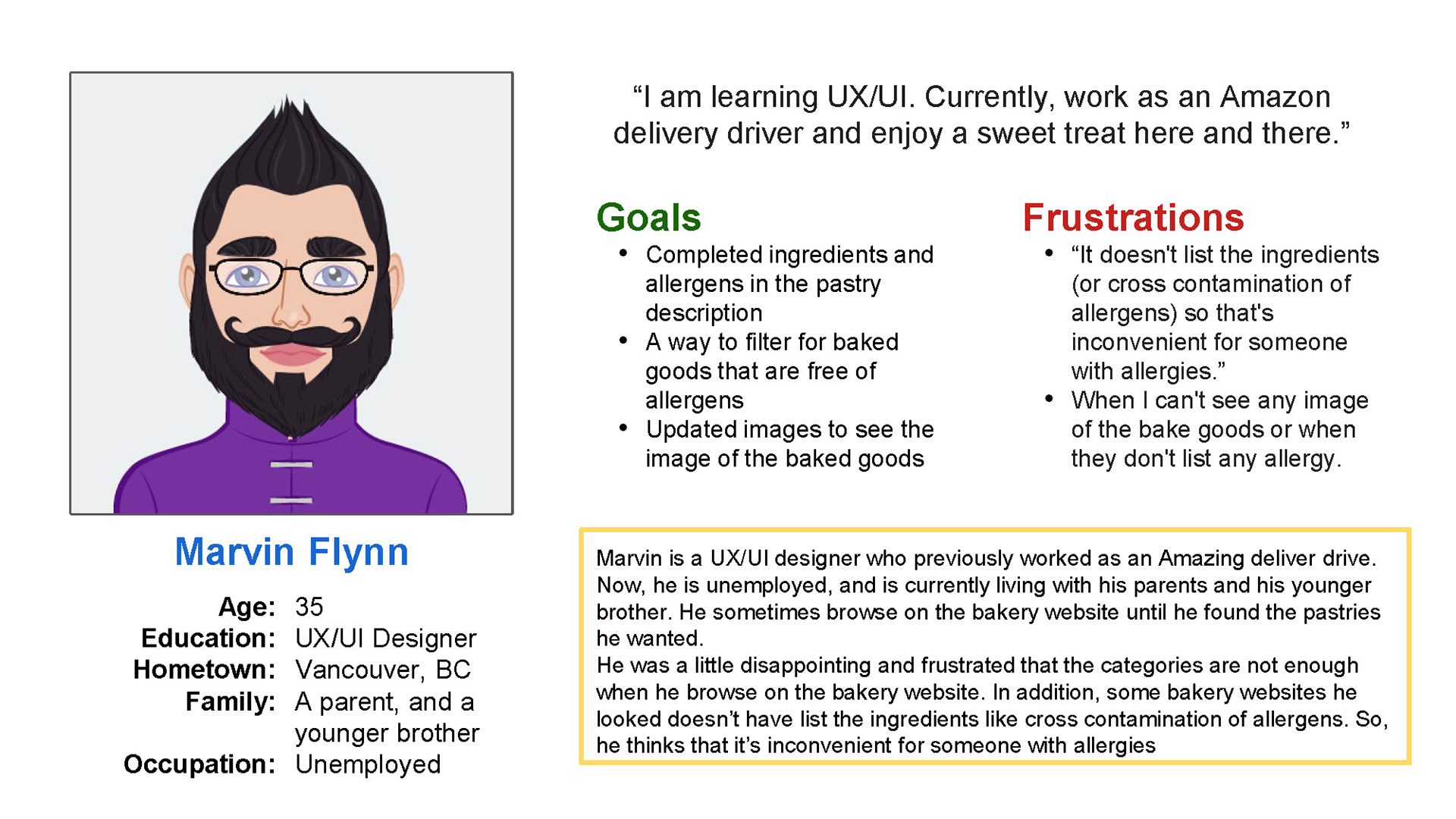
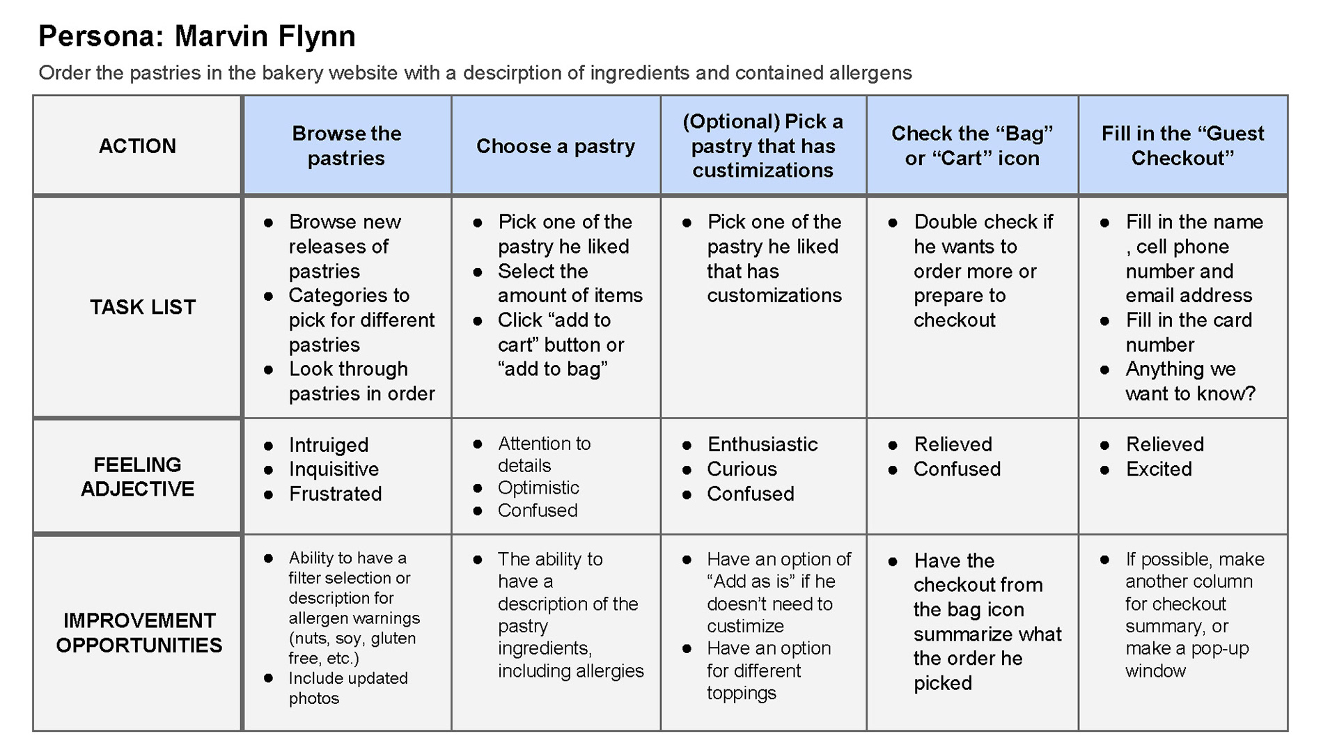
Problem Statement: Marvin is a UX/UI designer who wants indulgencies sometimes and needs to see updated pictures and descriptions for the ingredients list and allergens because he wants to make sure if the pastries, he picked are contained allergens before purchasing
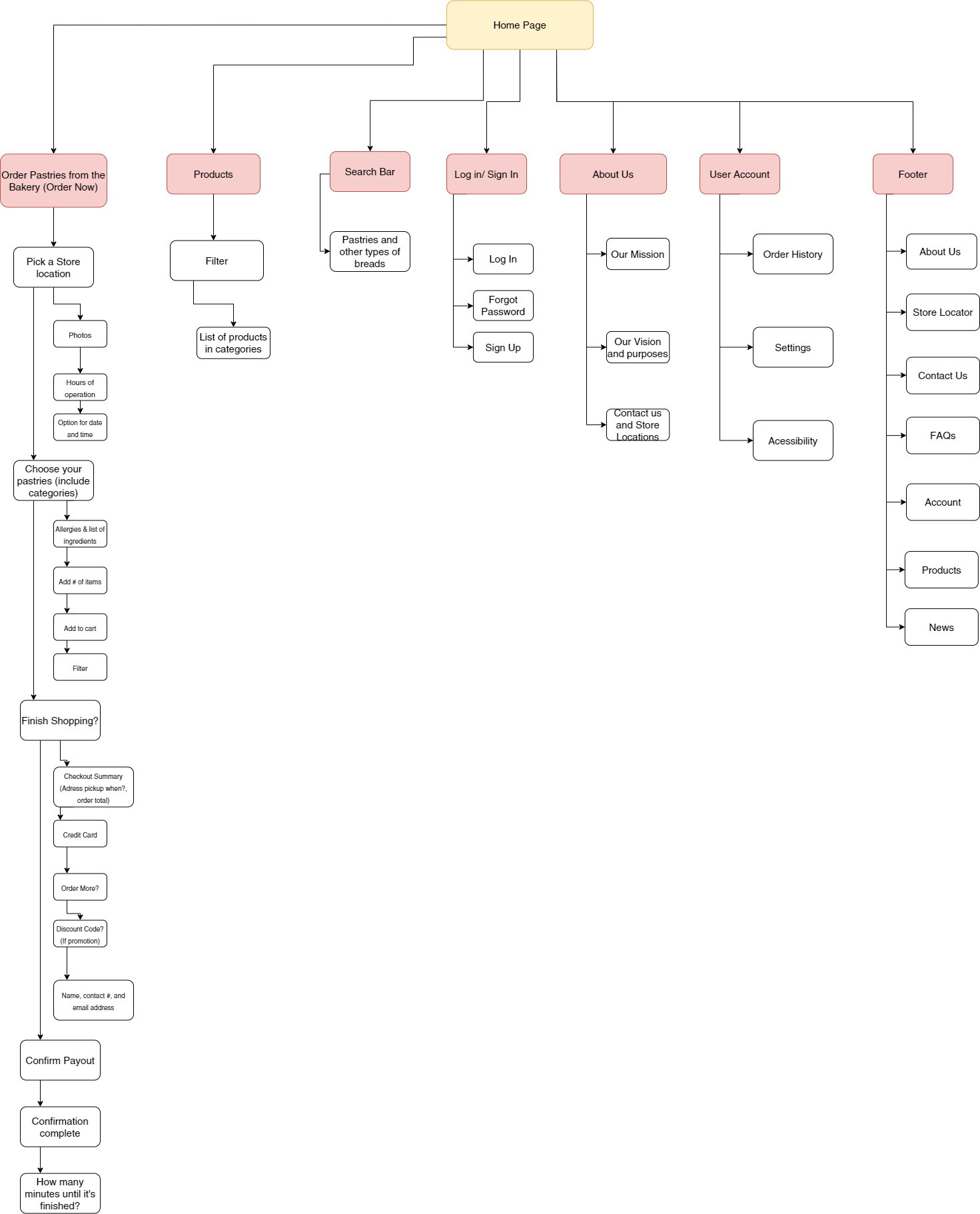
Sitemaps
From the sitemap, I included a few of the parent sections that will be needed and some detailed descriptions for the children section before designing my bakery website
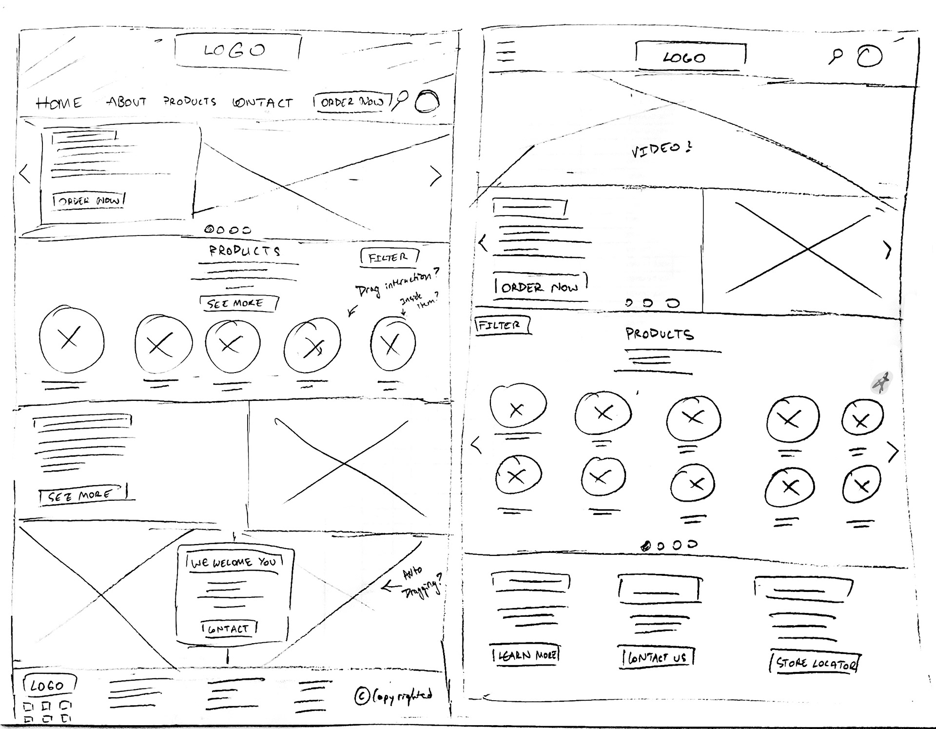
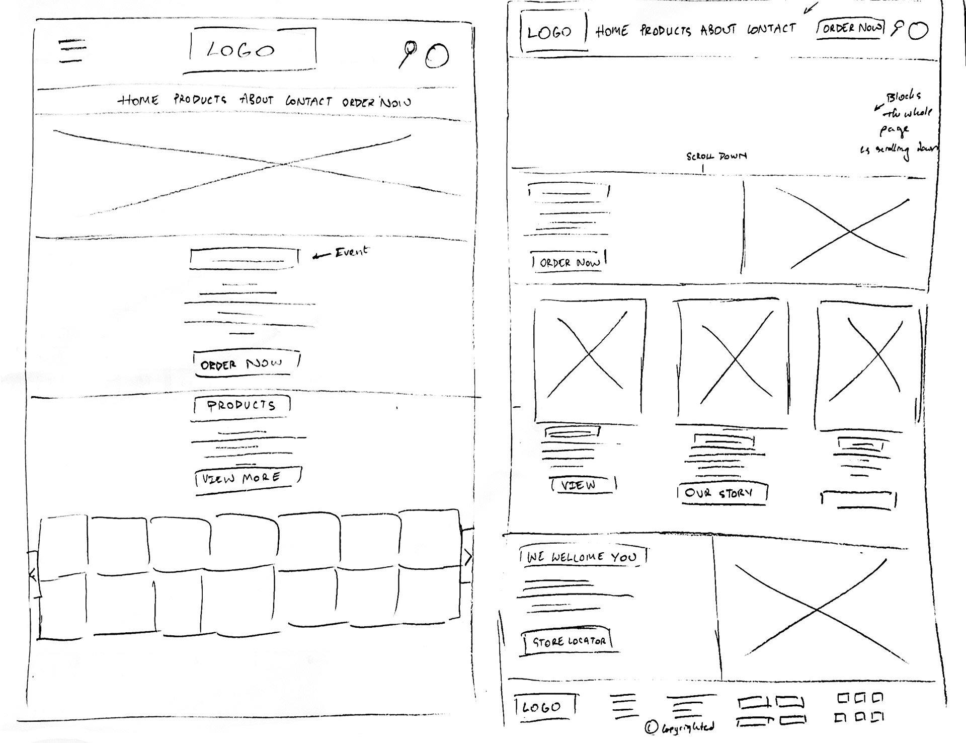
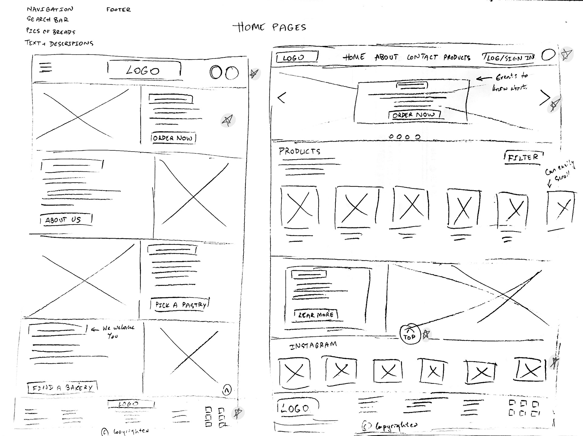
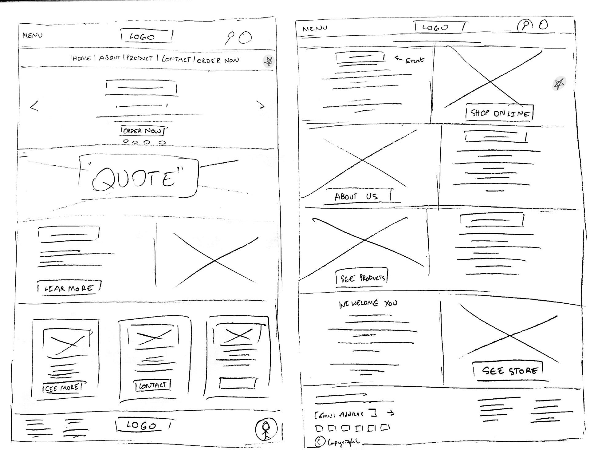
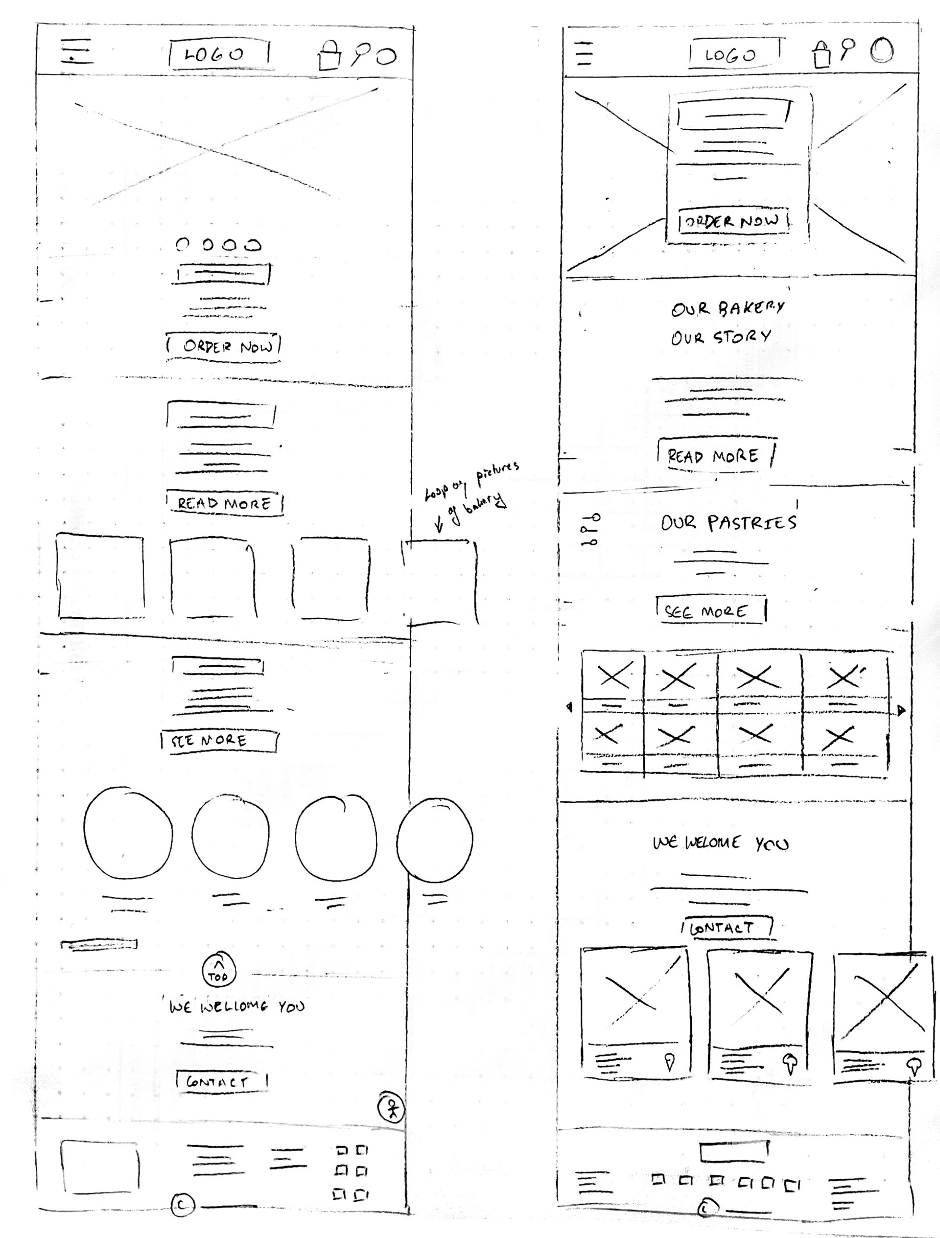
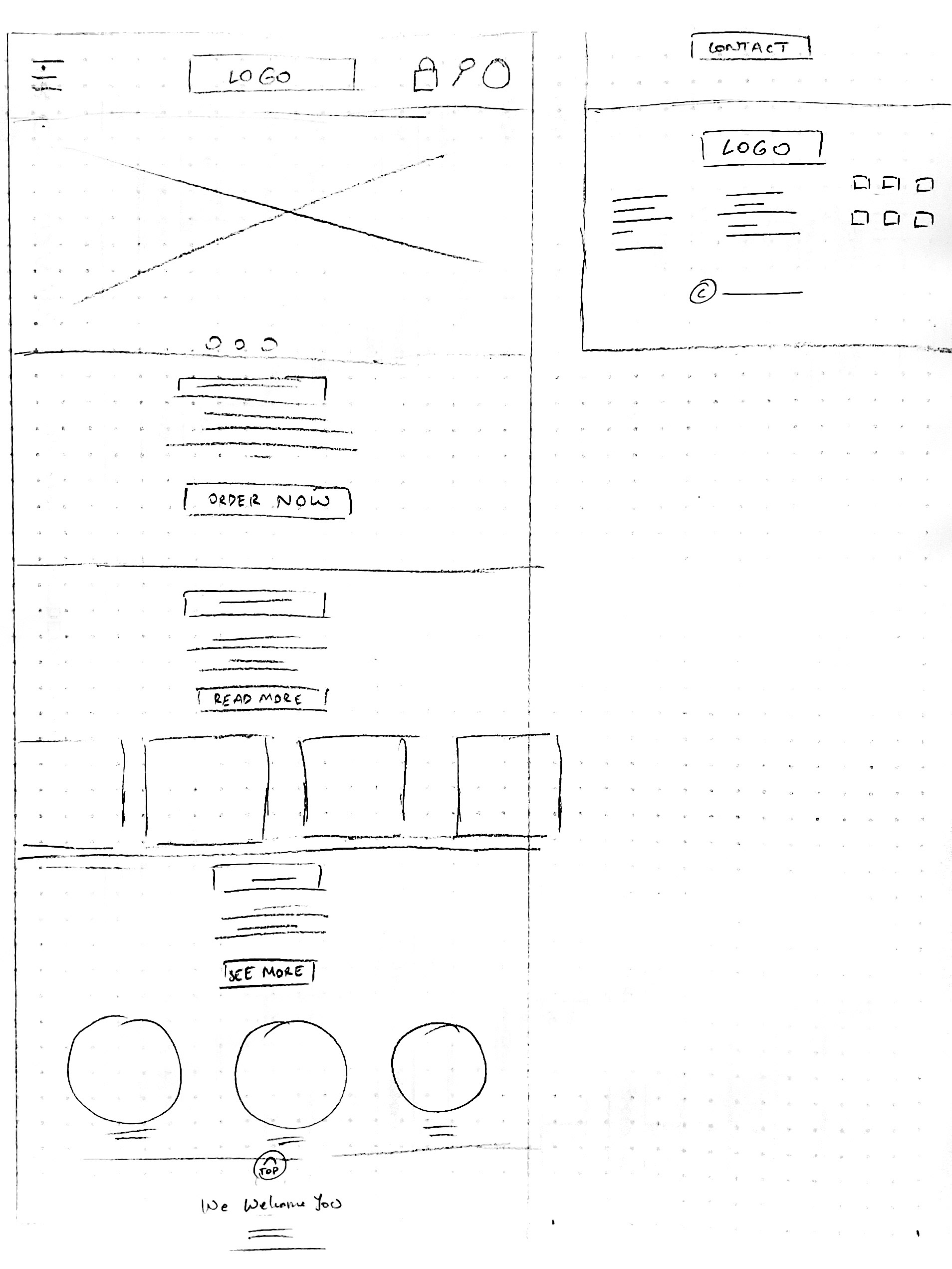
Paper Wireframes & Screen Sized Variations
I first made some basic sketches and then worked in Adobe XD to make my digital layout sketches. Some layouts needed to stretch out from the home page.
When I finished working on the responsive website, I worked on some screen size variations. I tweaked some icons and layouts so mobile users have the ability to either scroll or drag.
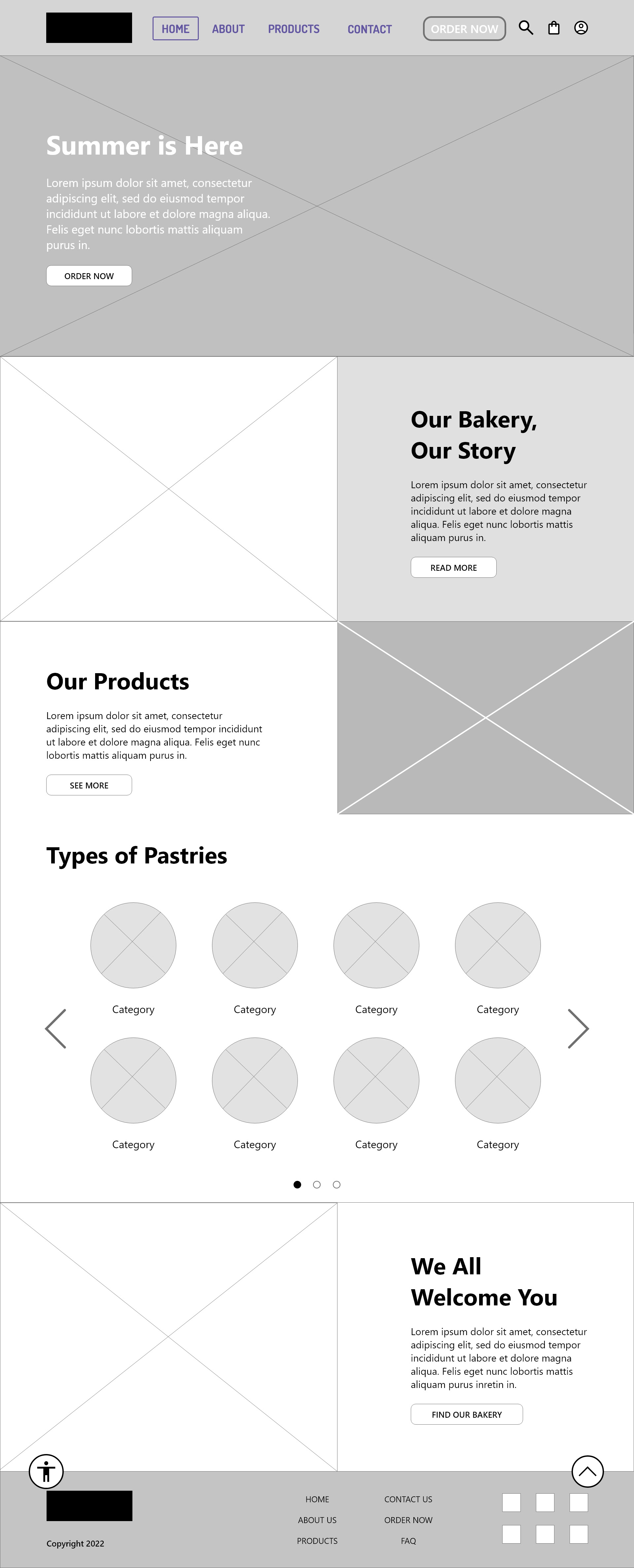
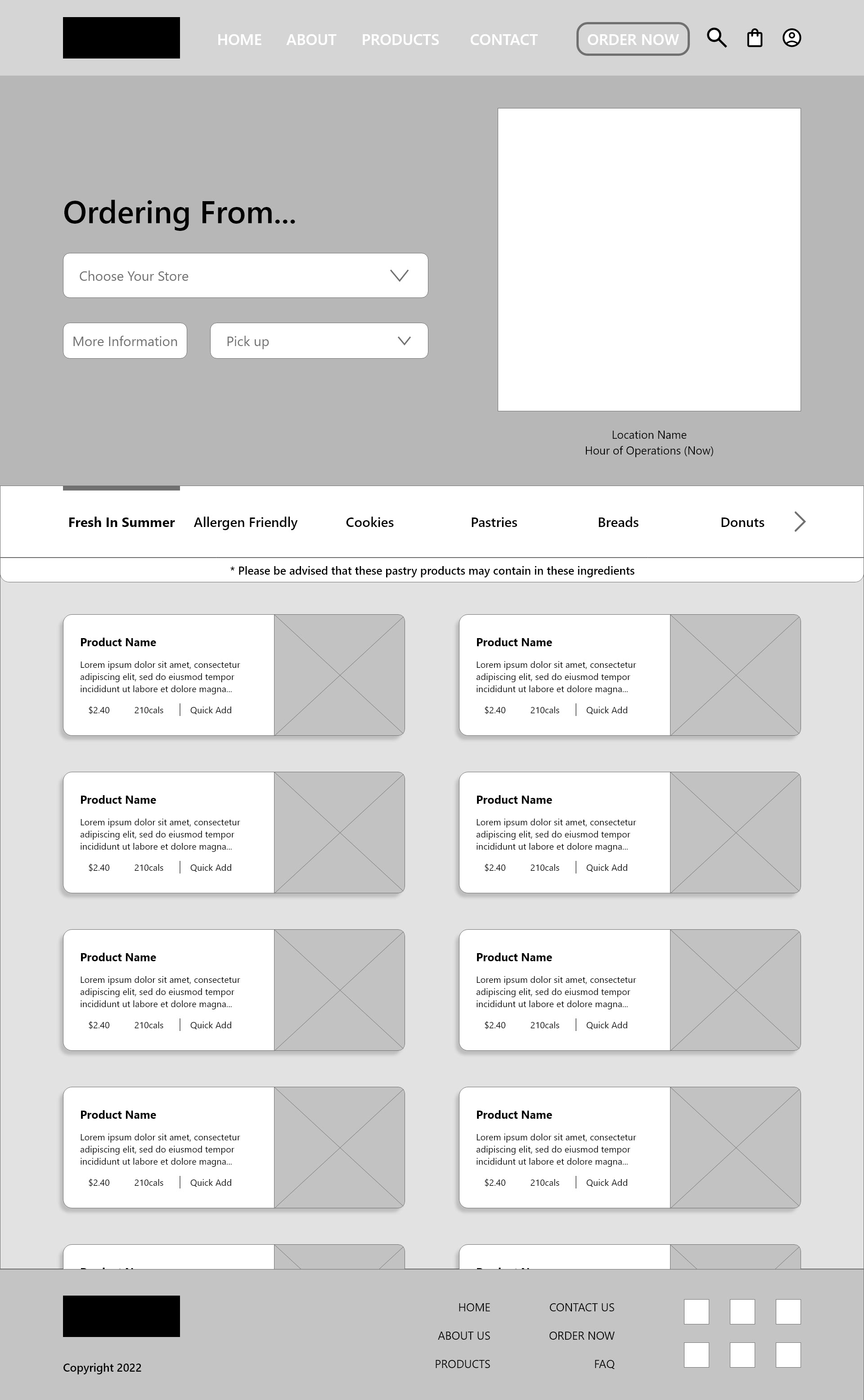


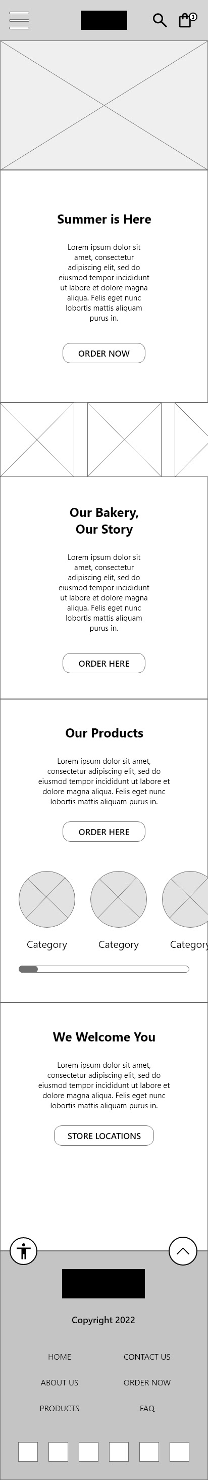
Digital Wireframes (Both responsive desktop & screen sized variations)
Based on the feedback and advice I got from my peers and instructors, I constructed my design layouts and linked different pages to make them more realistic. Since it’s a shopping experience on the bakery website, I created links that follow the shopping experience, not to the different navigation pages.

Usability Study (Findings & Insights)
While conducting the usability study on my participants, I found that they had the same initial feedback
that I had.
that I had.
1) Error User Flow - The user flow had technical difficulties as the participants tried to navigate throughout the process, and some participants were stuck on a page that couldn’t go back to the home page (P0).
2) Spacing, Sizing, and Phrasing - Most of the participants said there were negative spaces that needed to be fixed. They also said that the text on the “Complete” page could rephrased to flow better. Moreover, they said the CTA buttons should be resized (P0).
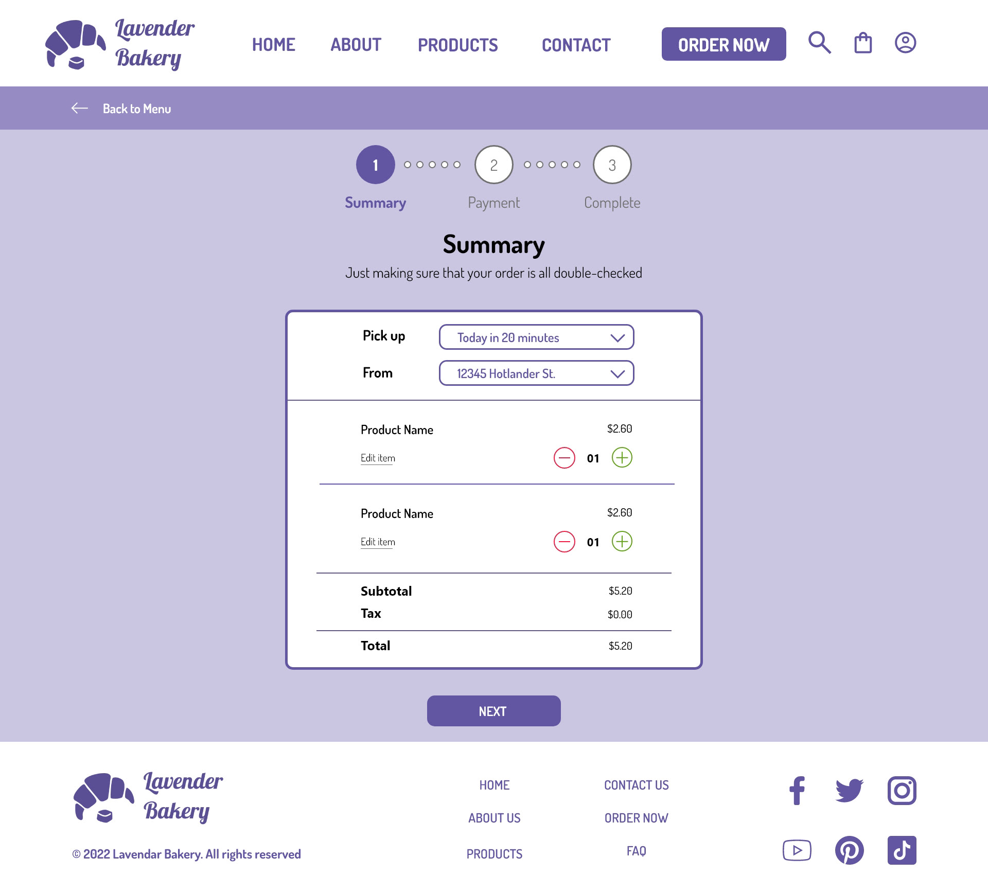
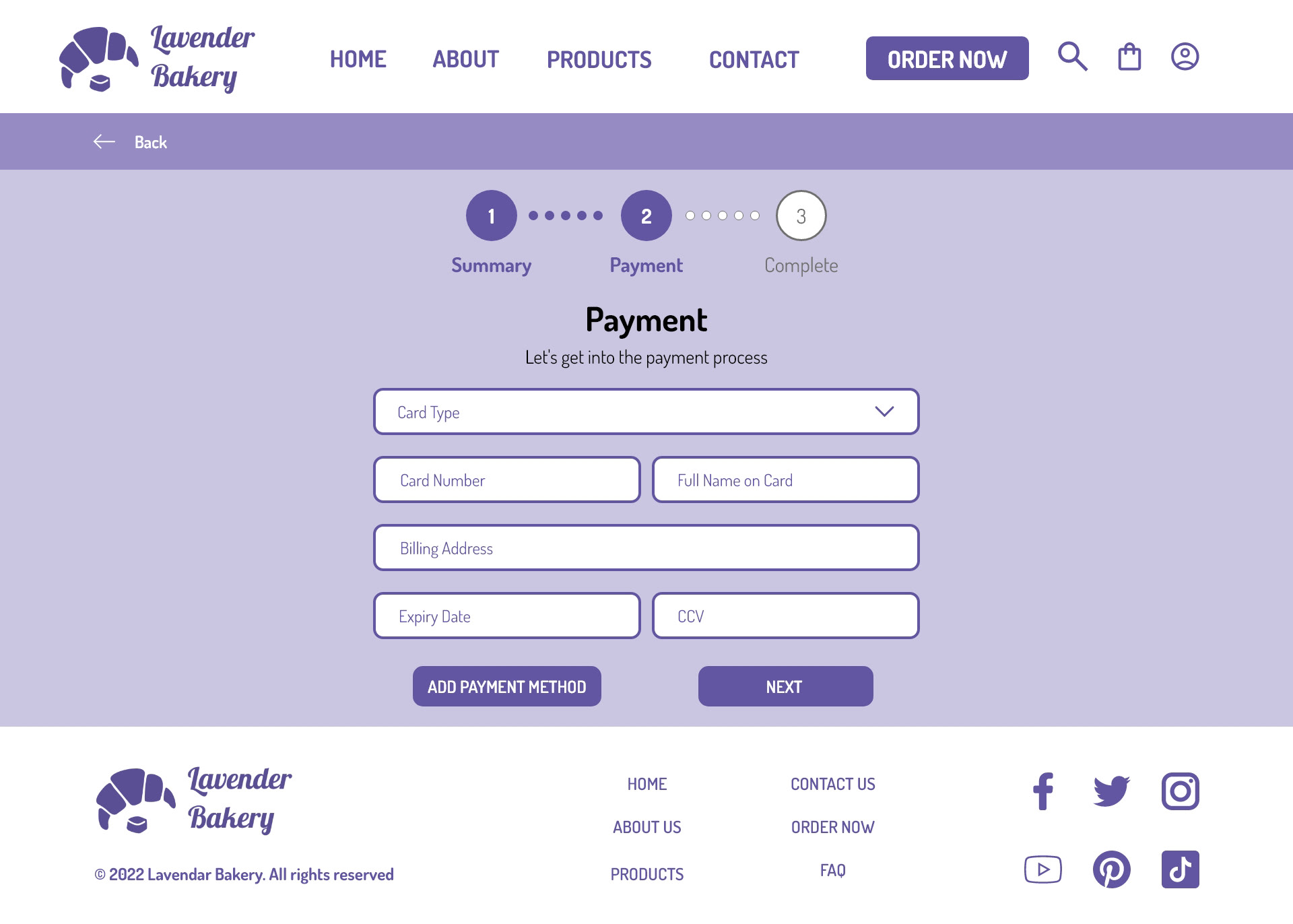
3) Stepper Forms - Some of the participants were concerned about the stepper forms because the steps were confusing. They preferred the summary page to go first and then the payment method (P0).
Mockups
From the feedback of my usability study, I tweaked a few of my designs and worked on my mockups, before working on the high-fidelity prototype. However, when trying to edit the colors, typographies, and hierarchies, I had some difficulty.
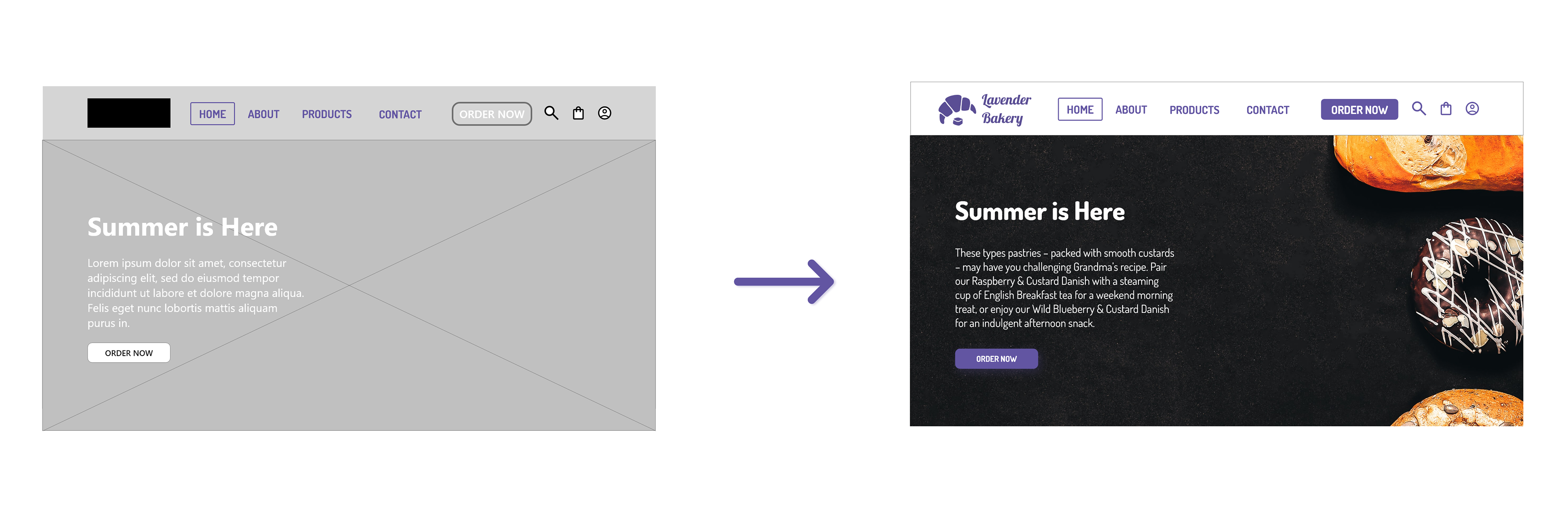
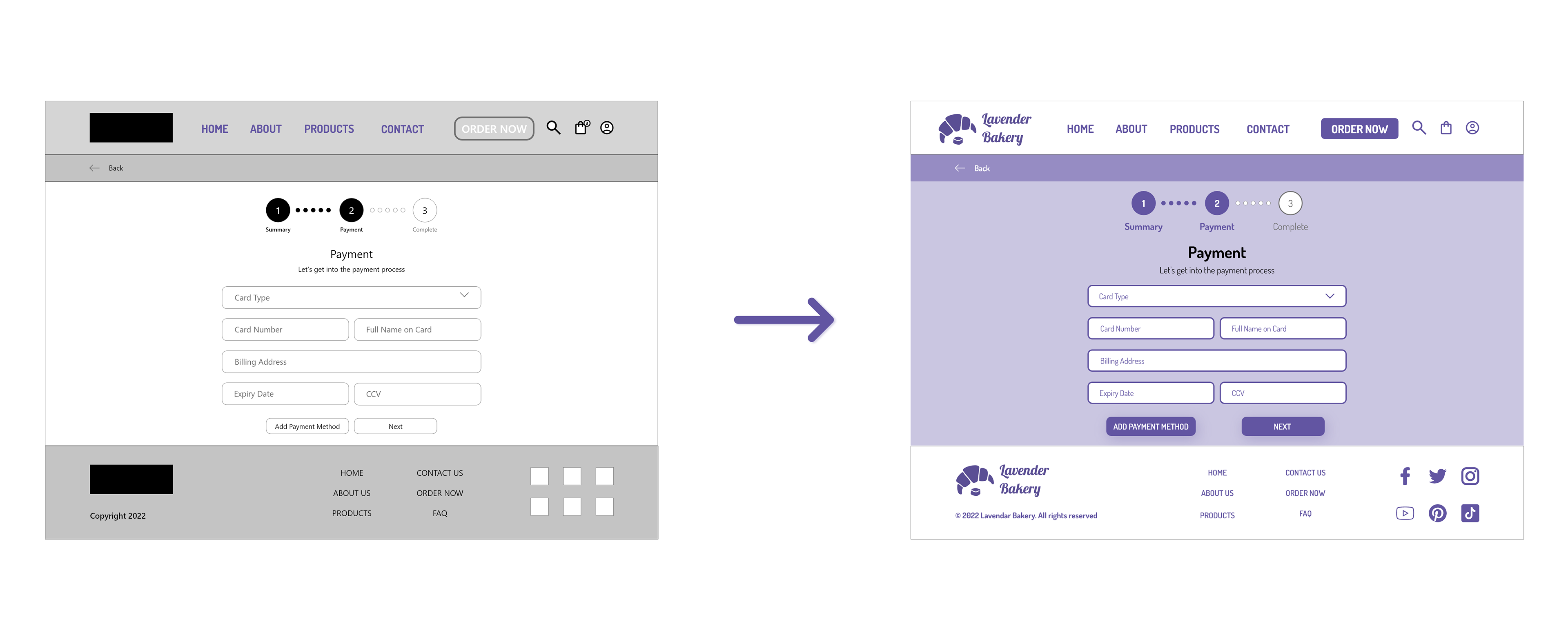
Before the usability study to after the usability study (left to right)
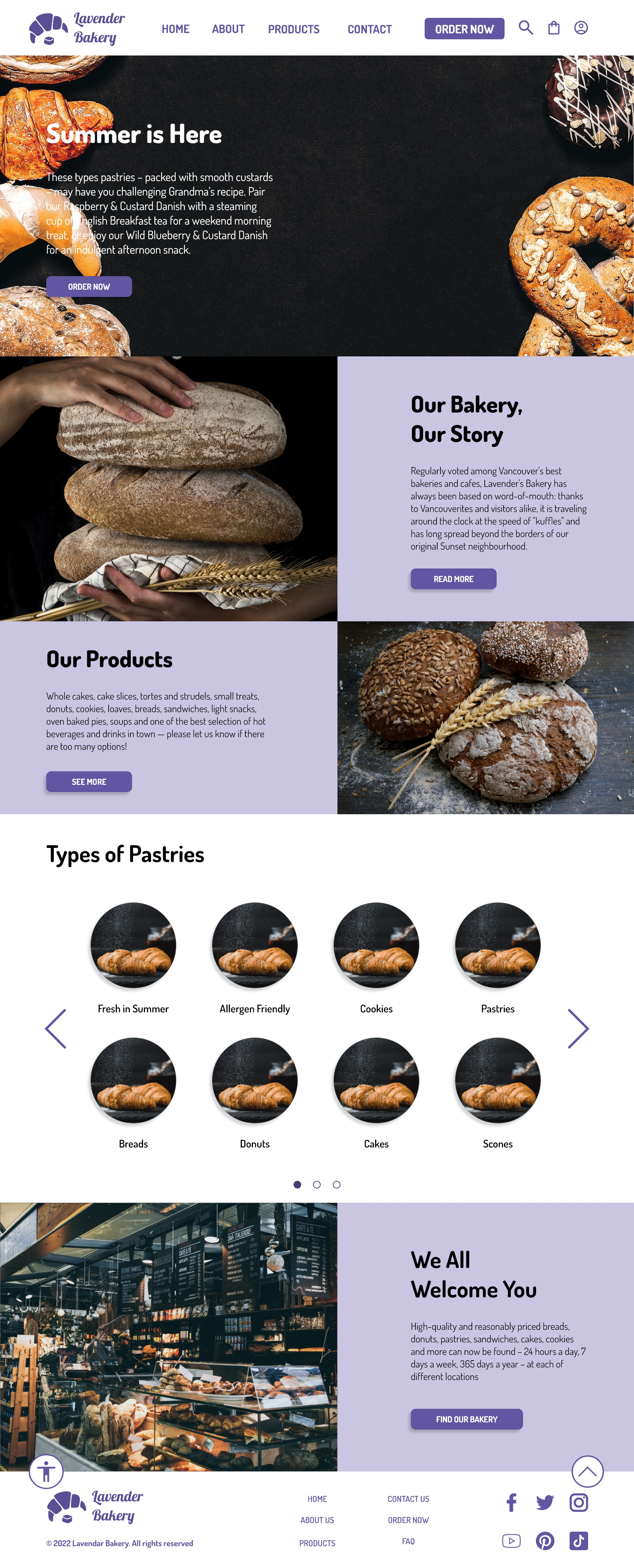
Mockup on the responsive desktop website
Mockup on Google Pixel 6
High-Fidelity Prototype
After developing my mockups, I designed them for all my screens. That includes colors, typographies, hierarchies, and components along with buttons/forms.

Accessibility Considerations
1) Lavender Color - I used a lavender color for the bakery website. But, the light, faded purple can be hard to see for those with color blindness.
2) Reordered the Steps & Added some Details - I reordered the position for the stepper forms and added a line for a "Billing Address" on the Payment step.
3) "Back to Top" Button - I added the "Back to Top" button so that users can click it and be automatically moved up to the top page.
What I Would Do Differently Next Time
Impact:
The customers can now explore the pastry’s description to see the ingredients and allergens before they purchase.
What I learned:
• Be more flexible.
• Time management and deadlines.
• Working on components, animations, and design layouts in Adobe XD.
• Time management and deadlines.
• Working on components, animations, and design layouts in Adobe XD.
Next Steps
1) Double-check the layouts and designs in Adobe XD to make sure they are in the correct position. In addition, seek more feedback from my peers, friends, and family.
2) Work on the prototypes, and check the linking prototypes for any errors to fix (including the hovering and how it interacts with buttons, forms, or clicks).
3) Keep testing more! There may be more mistakes or errors that users see unexpectedly when they’re testing high-fidelity prototypes.
Thank You
You can reach me at
Gmail: henry99.nguyen@gmail.com
LinkedIn: Henry Nguyen | LinkedIn
Behance: Henry Nguyen on Behance