Project Duration:
August 3rd, 2022 - August 24th, 2022
My Role:
Graphic Designer, UX Designer, Visual Designer, Motion Designers and Research
My Responsibilities:
User Research, wireframing, prototyping low fidelity and high-fidelity prototypes, user testing, user interface, and usability study
Software Using:
Figma & Adobe XD
About the App
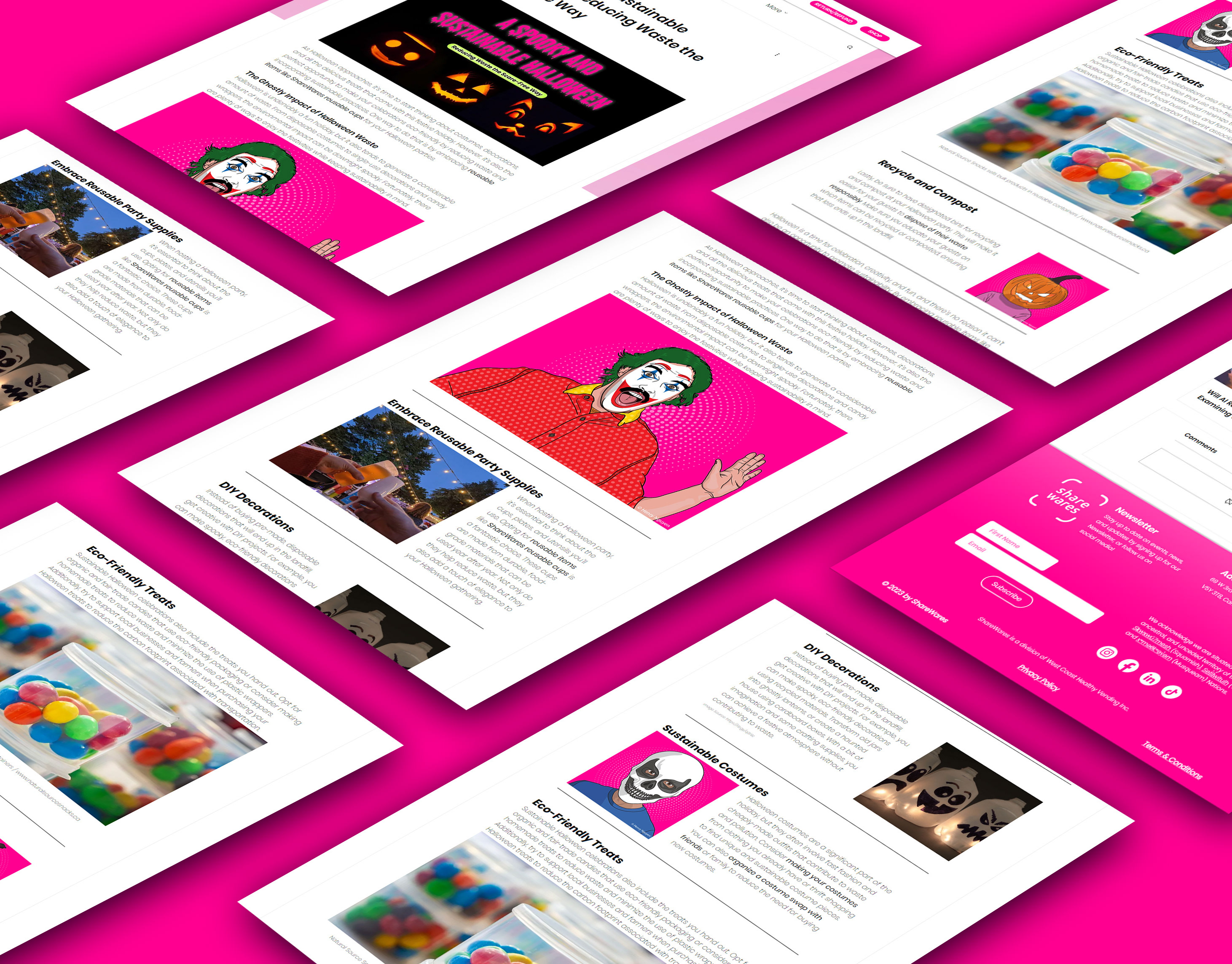
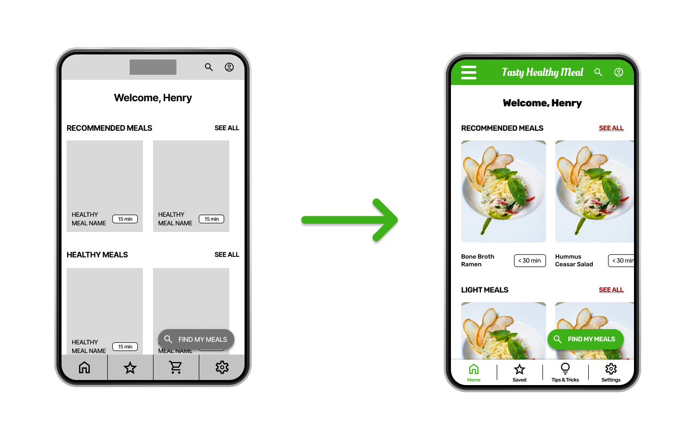
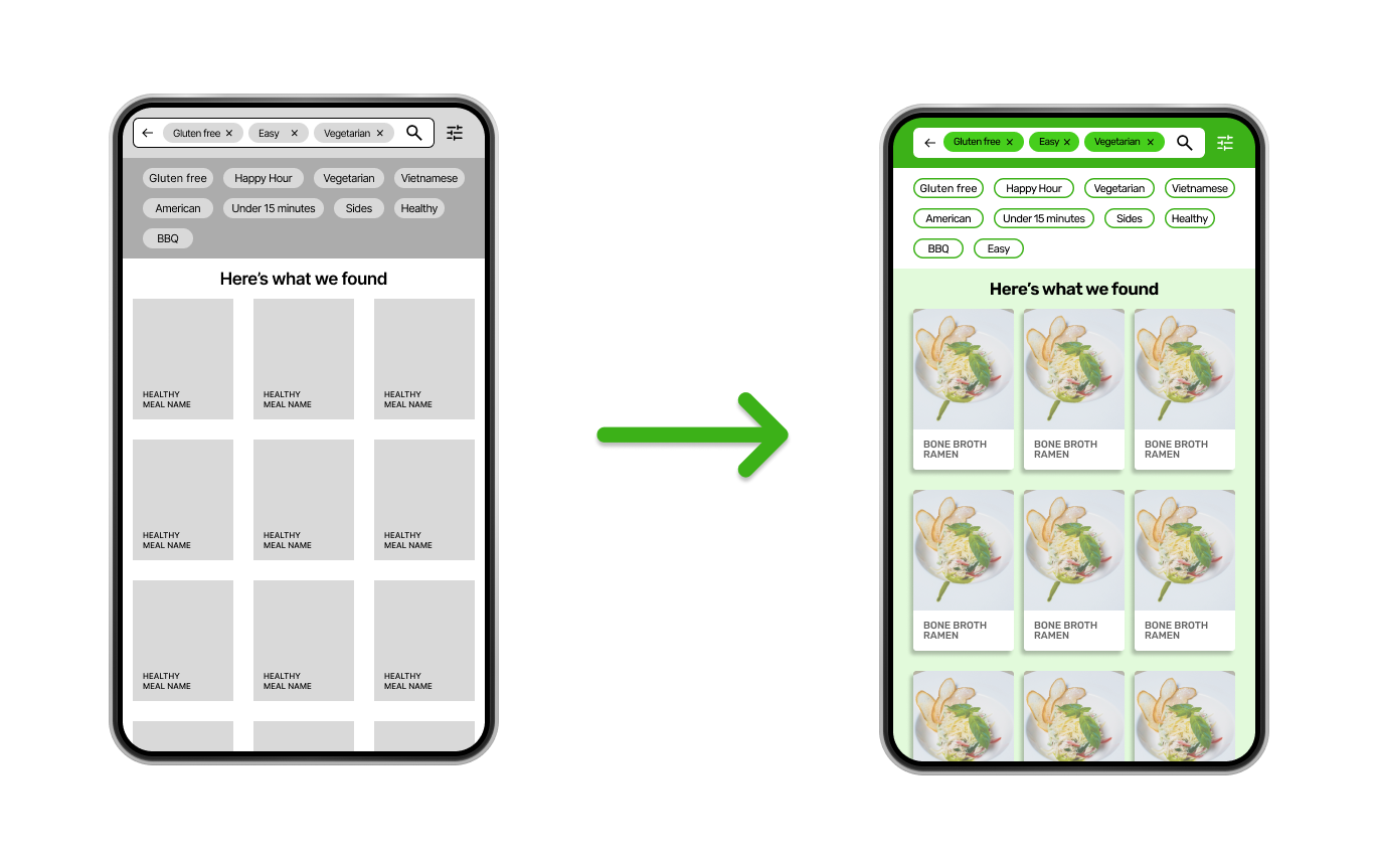
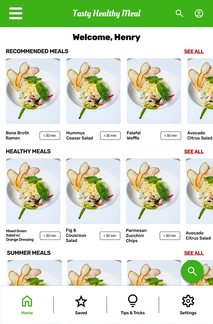
Tasty Healthy Meal is an app that helps users find recipes for healthy meals and learn how to cook. It also includes filter parameters like dietary preferences, allergens, cooking skills, amount of time to cook, etc.
User Research: Summary
As I conducted the user research for this app, I found there were a lot of users with allergies, and some users were vegetarians, which means they were very restricted to the meals they could make based on the recipes listed. After conducting my research, I became aware of how different apps included safe recipes for people with dietary preferences (gluten, dairy, etc.) and food allergies.
Problem:
Many users have food allergens or dietary preferences. Due to the app’s current layout, these users had trouble knowing which types of meals may contain those ingredients.
The Goal:
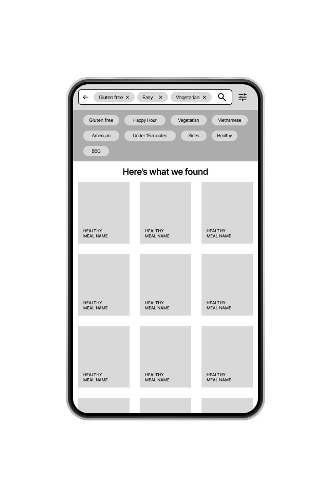
Create an app that filters for dietary preferences, food allergies, and restricted ingredients when searching
for meals.
for meals.
Pain Points
1) Not much detail on food allergens or dietary preferences - Some users have a hard time finding safe recipes.
2) Detailed Step-by-step - Some users found the instructions hard to follow.
3) More details on the ingredients - Some users found there was not enough information provided for them to understand all the ingredients and tools that were needed for a given recipe.
User Personas & User Journeys
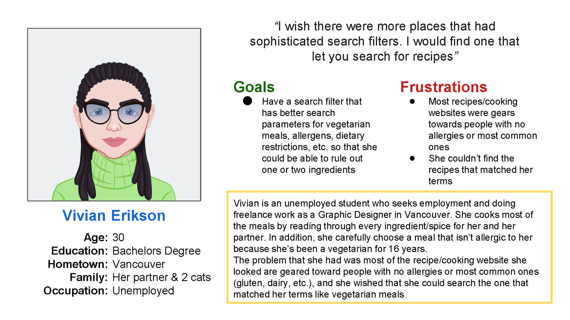
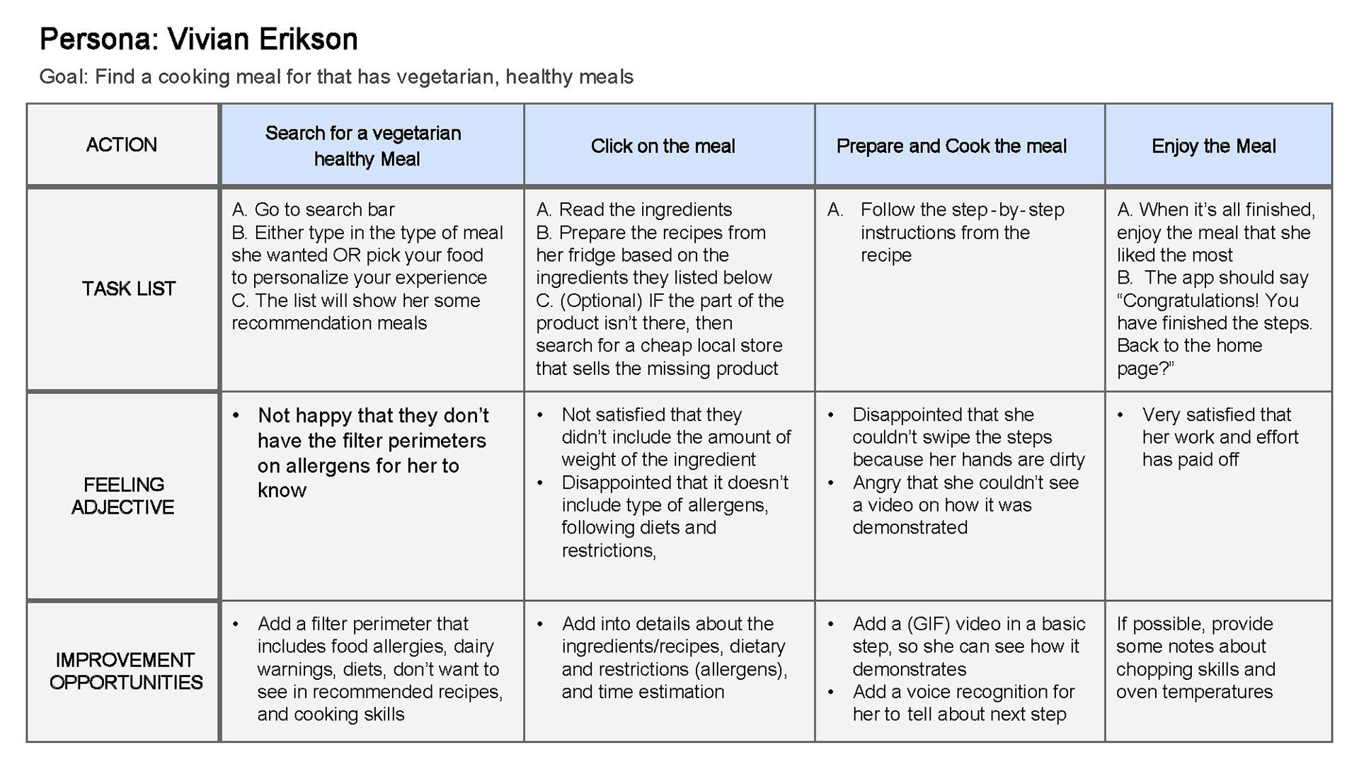
Problem Statement: Vivian is a vegetarian, who needs sophisticated filter parameters for vegetarian meals, allergens, dietary restrictions, etc. This would allow her to find recipes without any unsuitable ingredients and save time.
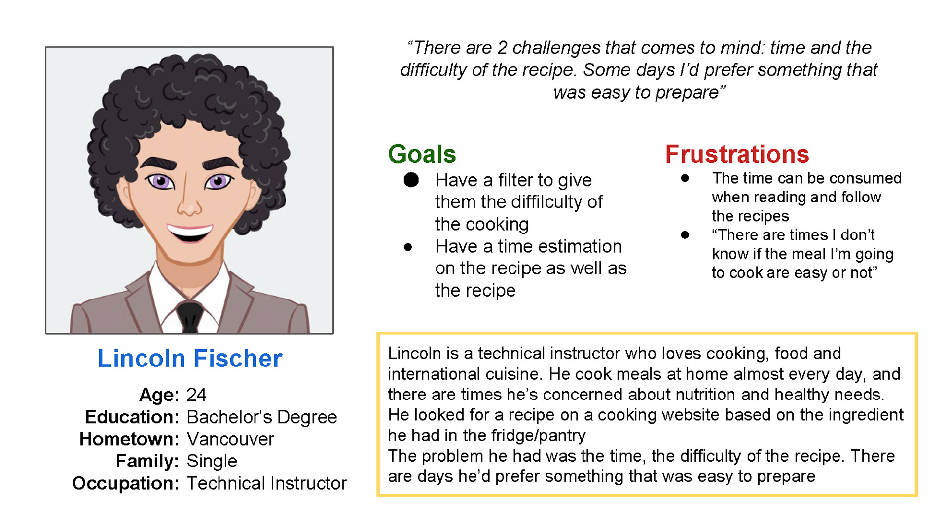
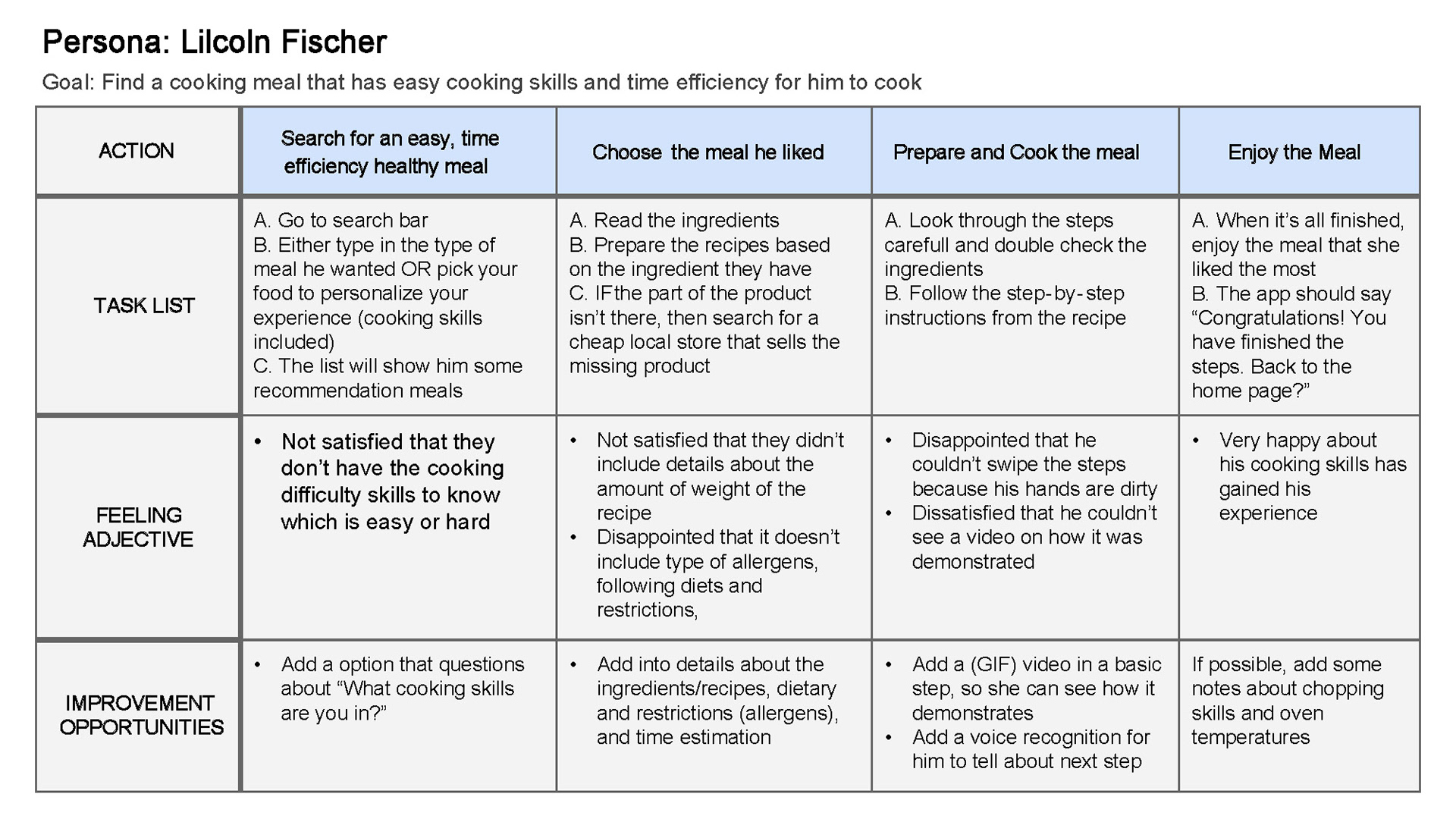
Problem Statement: Lincoln is a cooking lover who needs sophisticated filter parameters that include time estimations and cooking difficulty. This would allow him to pick quick-cook recipes, on days when he doesn’t have much time to cook.
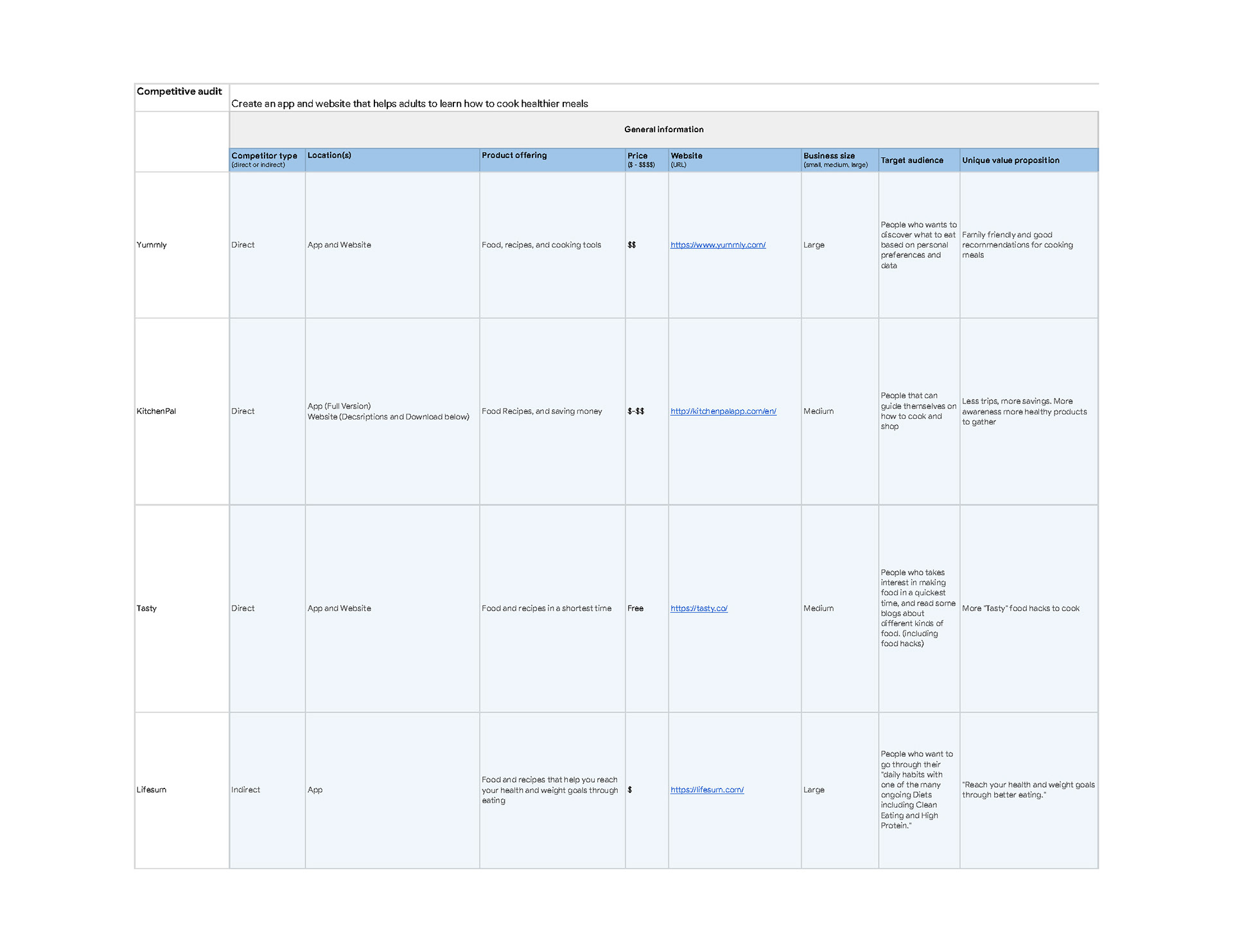
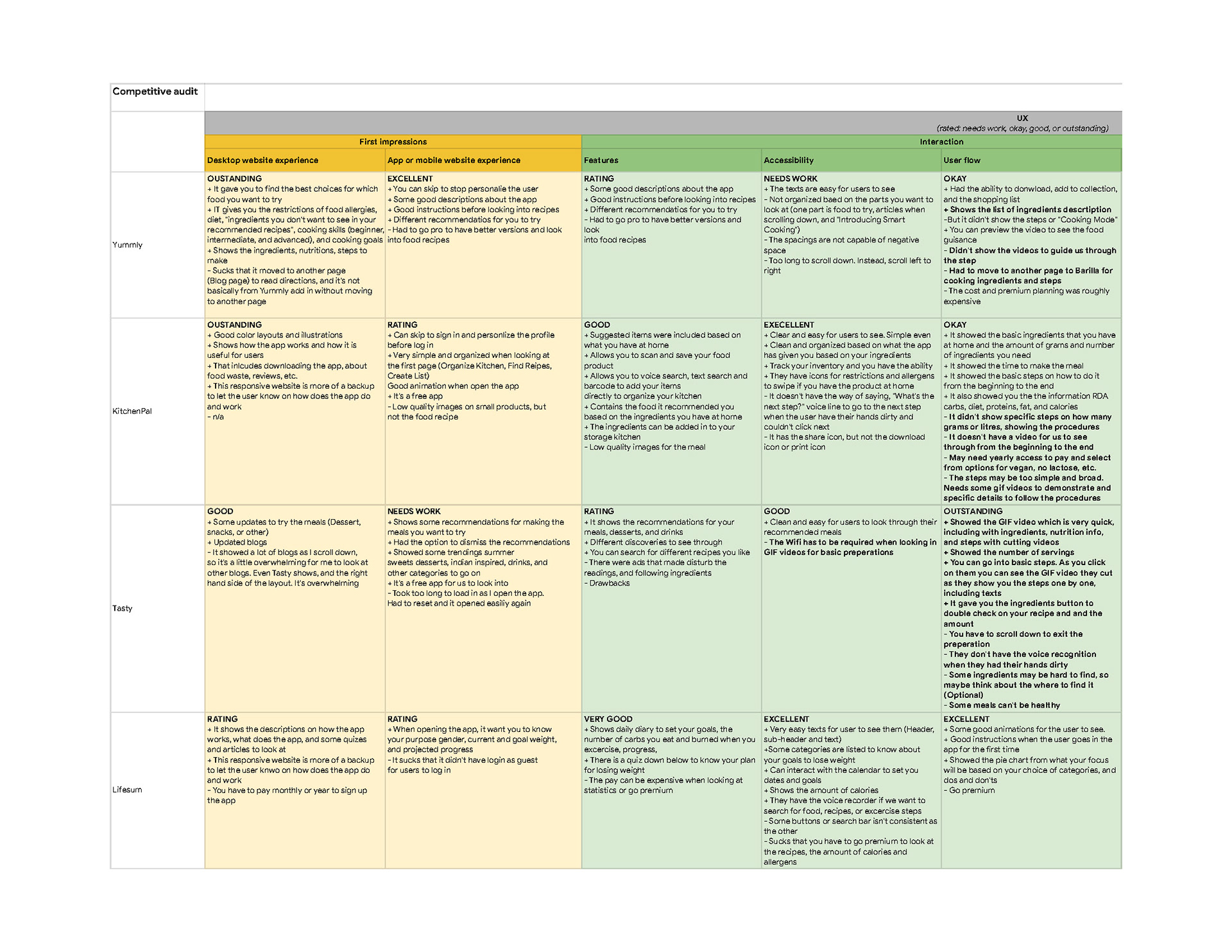
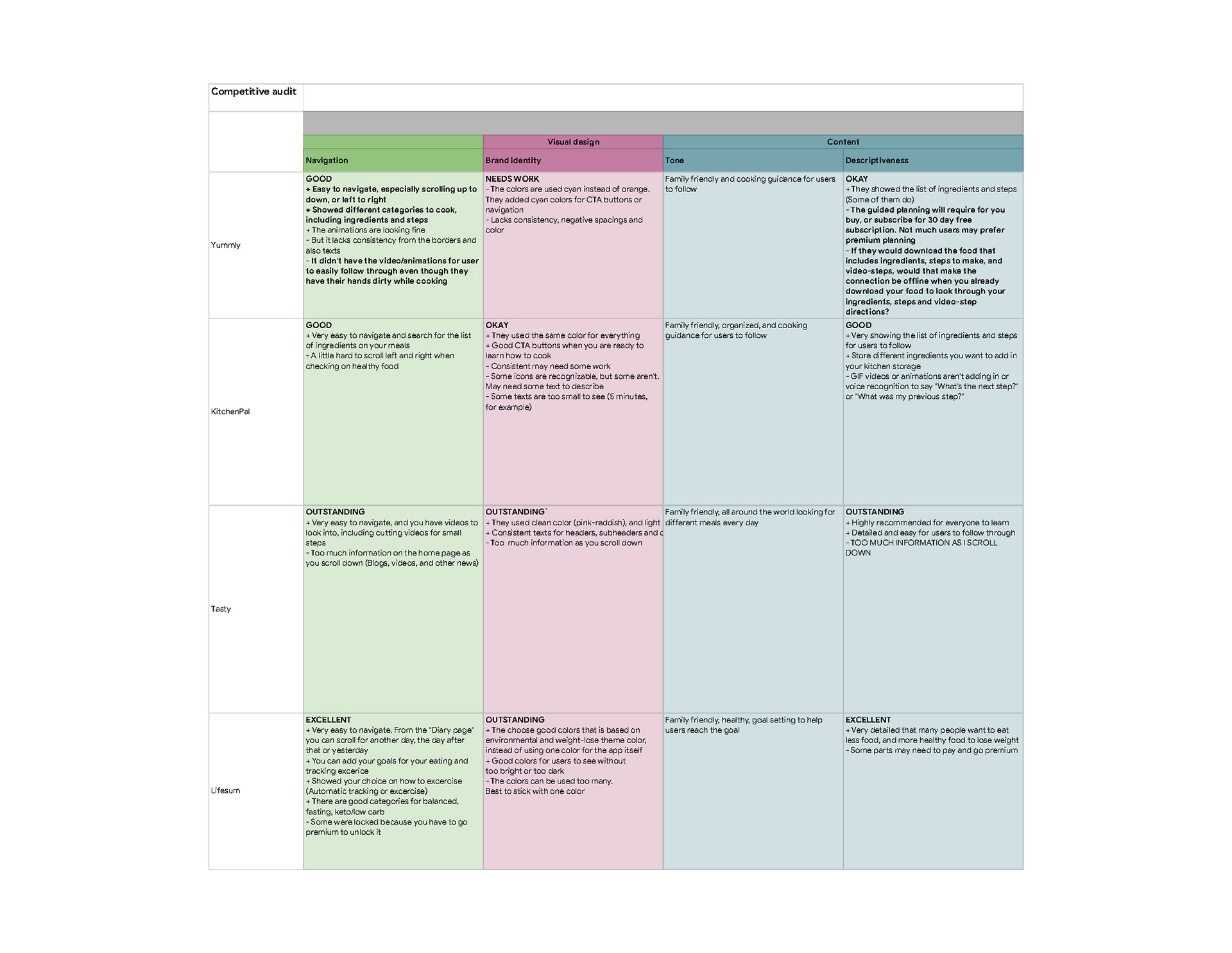
Competitive Audits
I looked into similar apps and responsive websites and was surprised to find that some included allergens & dietary preference search functions, and in-depth cooking steps. In addition, some of the responsive websites that I compared had different layouts: One website was meant to be used alongside the app (description of the app, how it works, reviews, etc.); another website was identical to the app but used a desktop layout instead of a mobile layout.
Ideation & Sketches
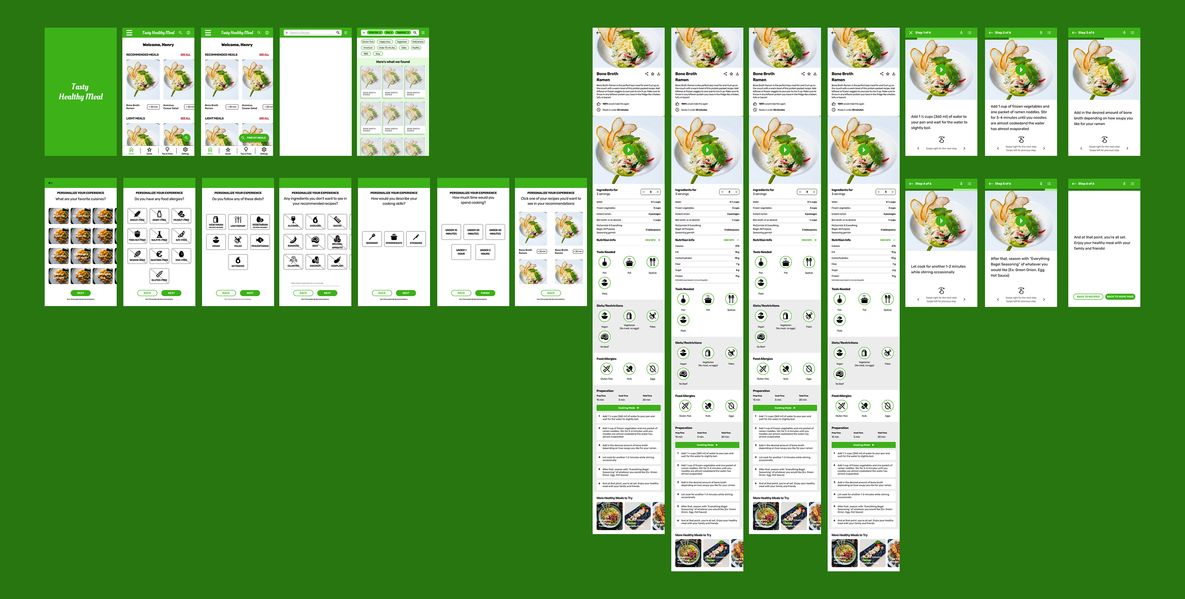
Based on the data I gathered from the competitive audits, I created concept sketches, focusing on how to help users determine if meals had any food allergens, and restricted recipes for those with dietary preferences. By doing so, users can learn how to cook without having to worry about making any modifications.
For my wireframes, I worked on designing how users would search, either by tapping on the search icon to find a healthy recipe or the advanced search filters to personalize their experience.
In addition, I wanted to make sure that the users will be able to navigate through the healthy meal search without trouble.
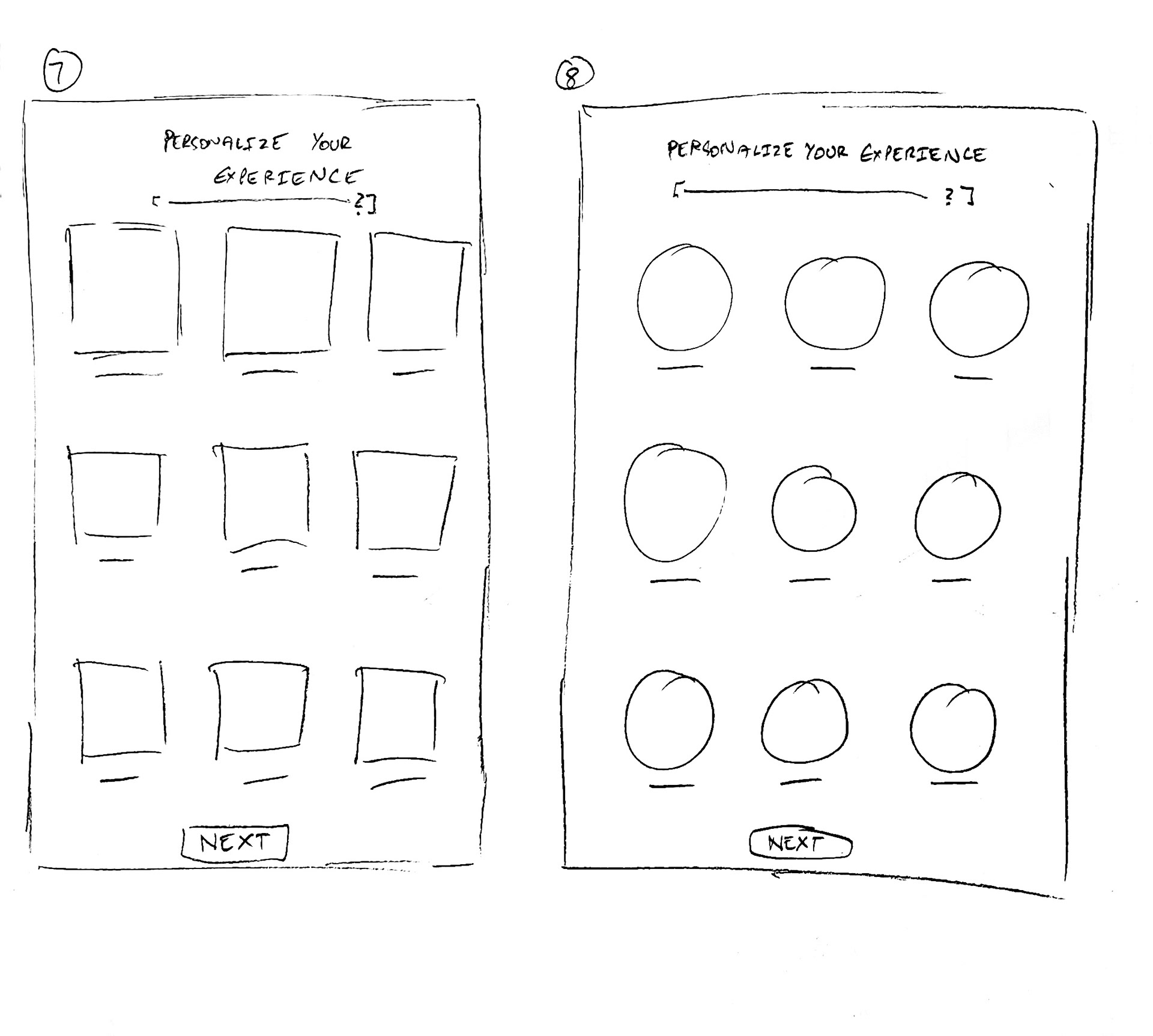
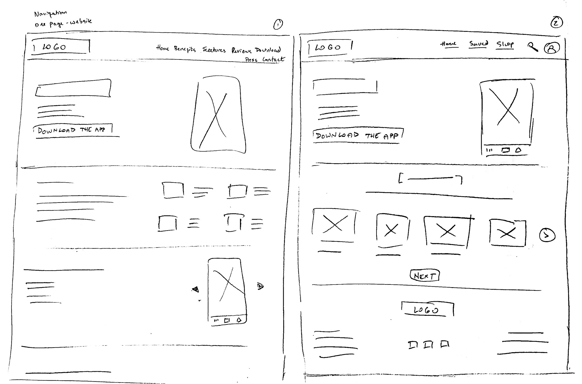
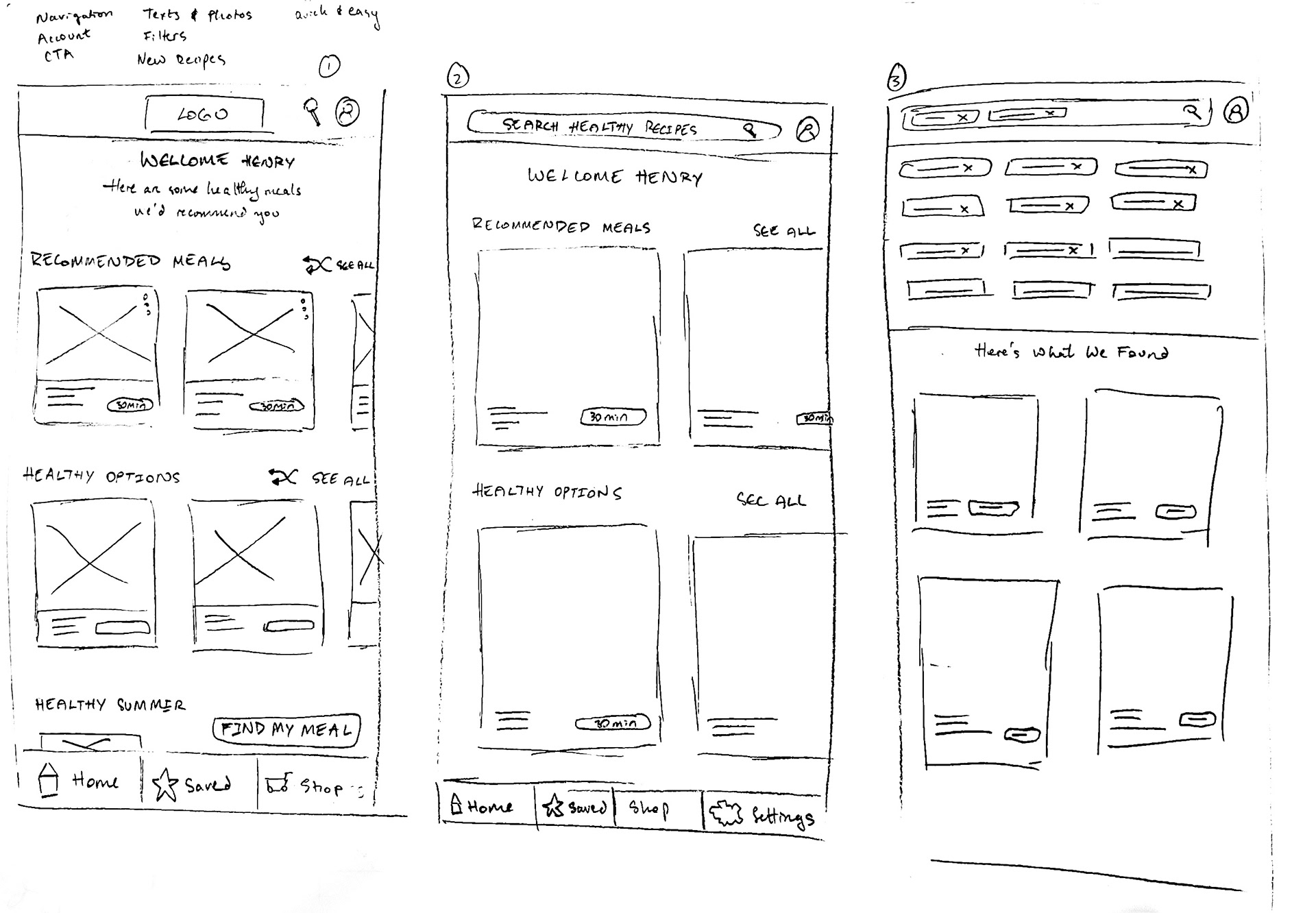
Paper wireframe sketches (Mobile app & responsive website app)
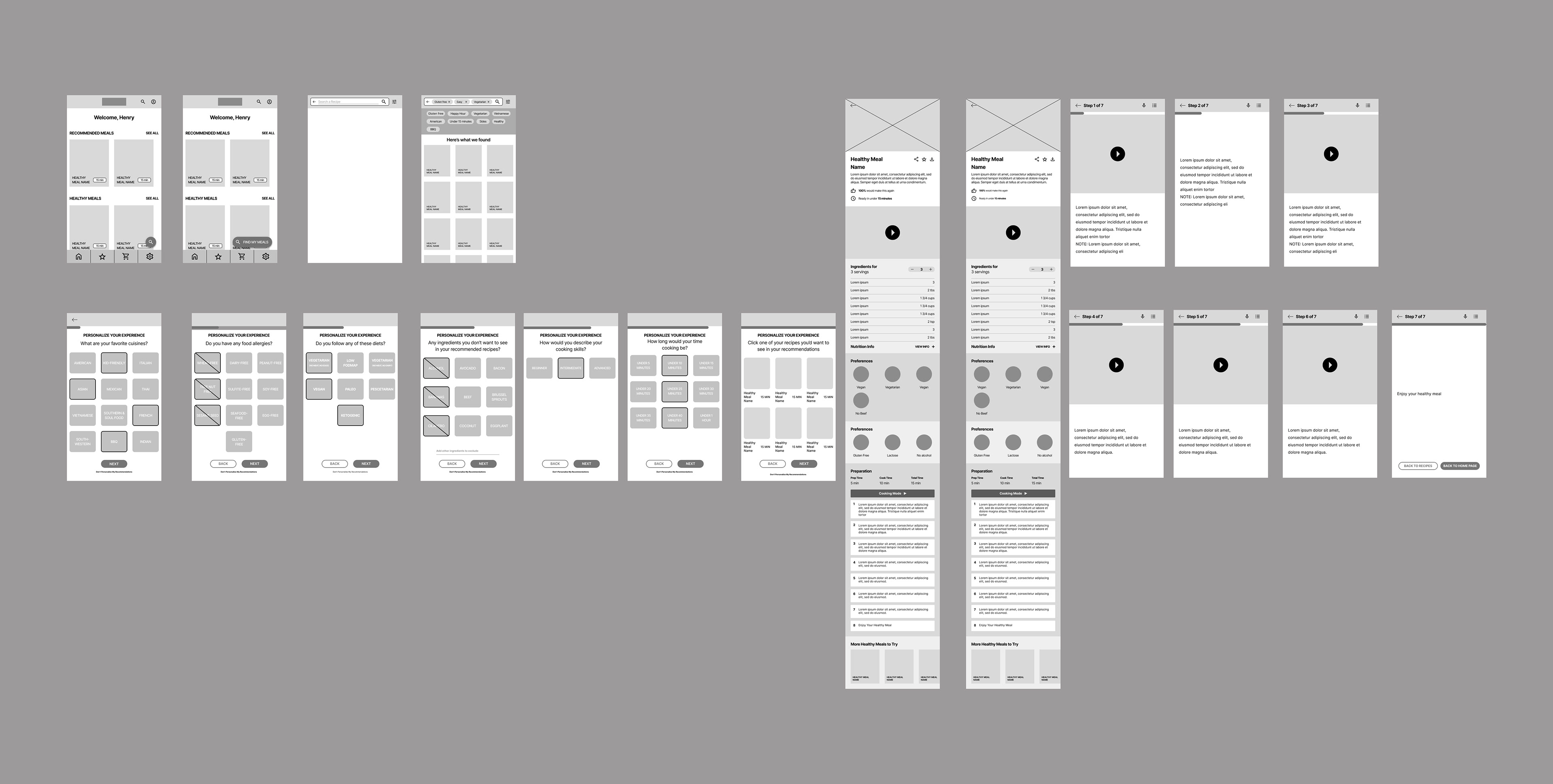
Digital wireframes for the Tasty Healthy Meal app
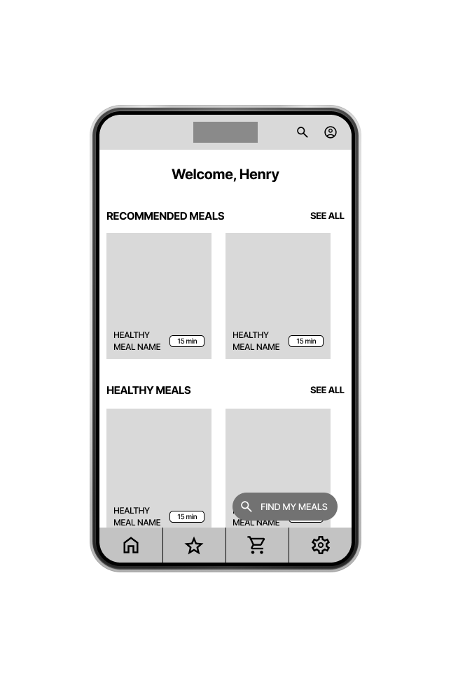
Low-Fidelity Prototype
As I finished working on digital wireframes, I started to link the prototype screen by screen. In addition, I made sure that the user flow would be easy to navigate from beginning to end.
Usability Study: Findings
From the insights I gathered from the usability study, I found most participants have a hard time doing basic app actions, as there were no instructions in the app on how to use it (ex: in “Cooking Mode”, it didn’t say you need to drag the screen when swiping to a next page). In addition, the problems and mistakes that participants reported were considered to be P0s
1) Unresponsive CTA Buttons - Some participants found that the buttons are not responsive when clicking on them. (P0)
2) "Cooking Mode" Button - Some participants had a hard time finding the “Cooking Mode” button because the button wasn’t filled in to make it stand out (P0)
3) Dragging Problems & Instructions - Some participants had a hard time navigating the app, due to the lack of on-screen instructions (P0
2) "Find My Meal" Button - Some participants didn’t like that they had to double-click on the “Find My Meal” button for it to work (P0)
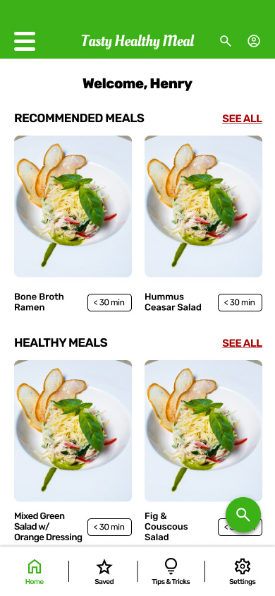
Mockups for the App
After conducting the usability studies, I first fixed the most pressing issues (P0). After that, I worked on finding new typographies, different colors, and layouts that would fit my mock-ups.
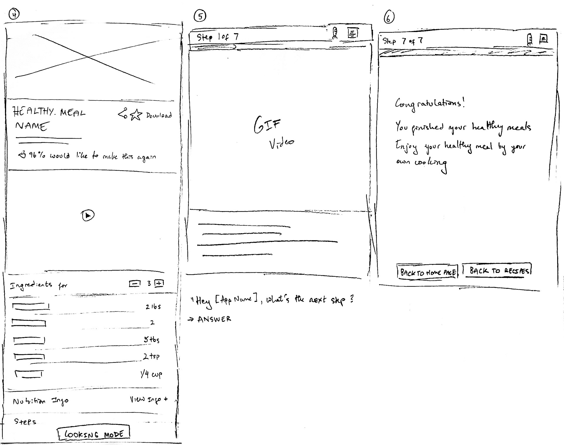
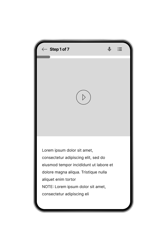
From the participants’ feedback, they had a hard time trying to drag instead of tapping the screen. So, I tried to figure out a way to give an instruction on how to drag after they clicked on the “Cooking Mode” button.
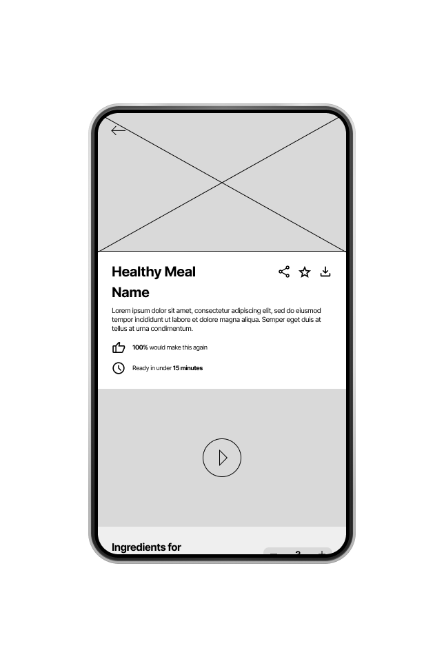
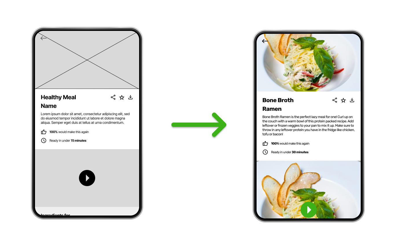
The Title & The Image
Some participants said having the title name inside the food image made it hard to read. So, I decided to give some negative spaces between the title and the image.
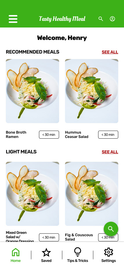
Spacings & Intereraction
Many participants said there was not enough space between the text and image, and the interactions on the button. So, I tweaked the design, making it easier to scroll down and click the interactive buttons.
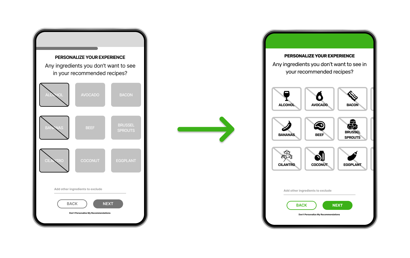
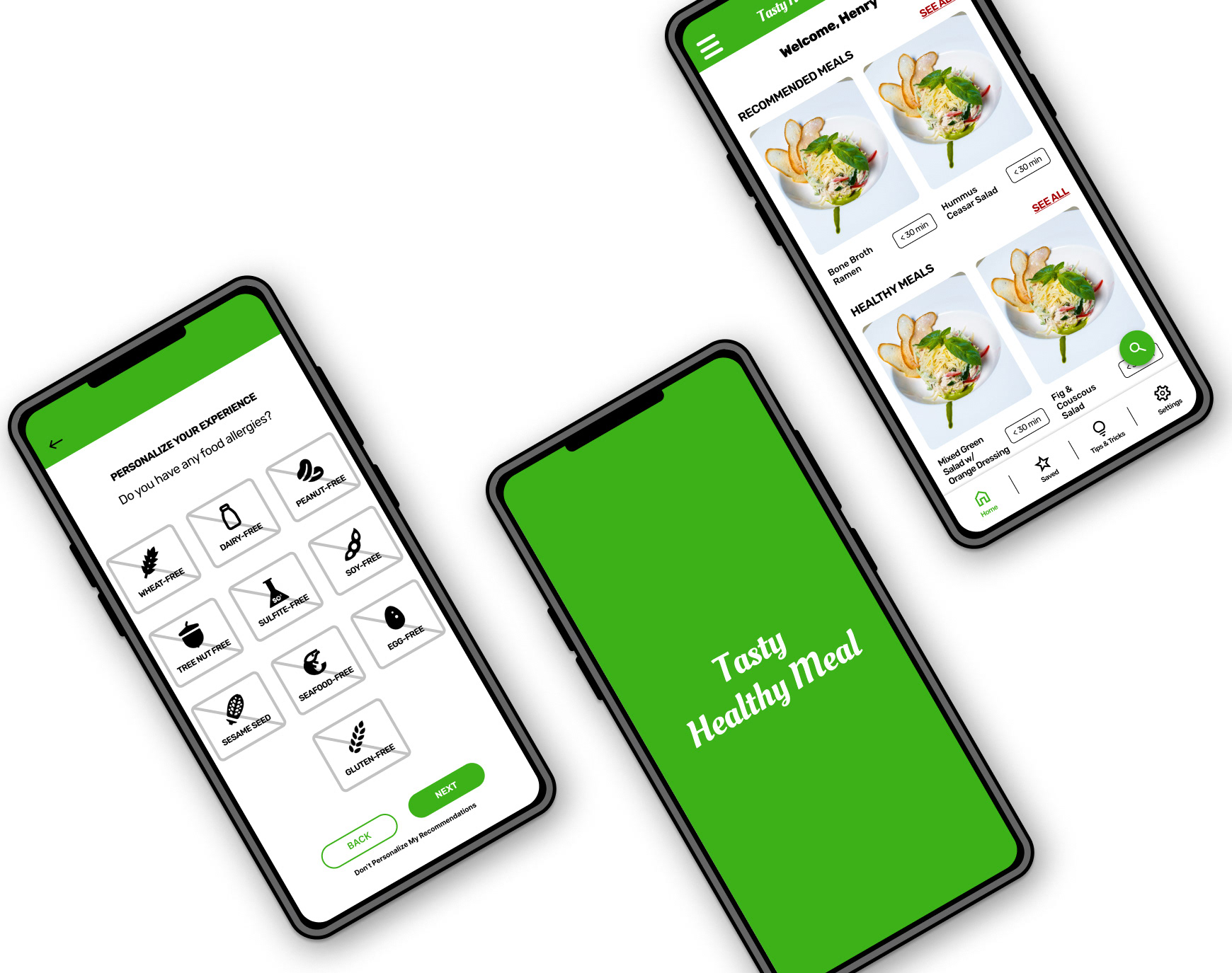
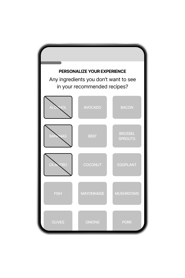
More Options & Scrolling on "Personalize Your Experience"
Because there were lots of food allergies and dietary preferences listed, some participants didn't like to scroll down to see options. Instead, I edited it so that users can scroll right to see more options.
More Options & Scrolling on "Personalize Your Experience"
In the ingredient section, the only problem that the participants reported was the "Cooking Mode" button, because the button didn't stand out. To fix this, I added colors to the button, and added spaces between the ingredients and steps, making it easier to read.
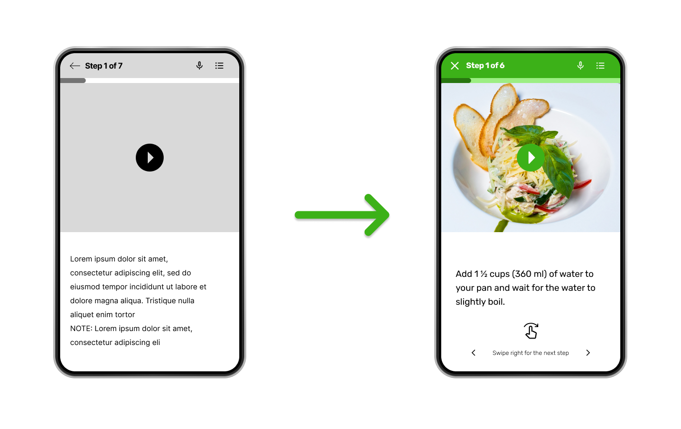
Instructions are Needed
Some participants were having trouble swiping left or right because there were no instructions given in the app itself. Based on my participant's thoughts and feedback, I added some instructions needed to let users know beforehand. after they finished their steps for cooking their meals.
Mockups for Screen-Sized Variations
iPhone 13 Pro
iPhone 13 Pro Max
iPad mini 8.3
High-Fi Prototype
I worked on basic details on the components I would be using from the low-fi prototype, and added lots of information that would be included for my cooking healthy meal app for my high-fidelity prototype (step-by-step, descriptions and ingredients of the healthy meal, etc.)
Accessibility Considerations
1) Readability between texts and images - Having the text and images combined made it hard for users to read the text inside the image. It would be better to separate the text and image to make it more accessible.
2) Better filter parameters on "Personalize Your Experience" - I added some questions from “Personalize Your Experience” to give users the option to add in food allergies, recommendations, dietary preferences, etc. to make it easier for the user to navigate the app.
3) Voice Recognition on "Cooking Mode" - As the user’s hands may get dirty from cooking, it would be hard for users to swipe the phone to see the next step. I added voice recognition for the “Cooking Mode” steps, so users can say “next step”, to move forward in the recipe.
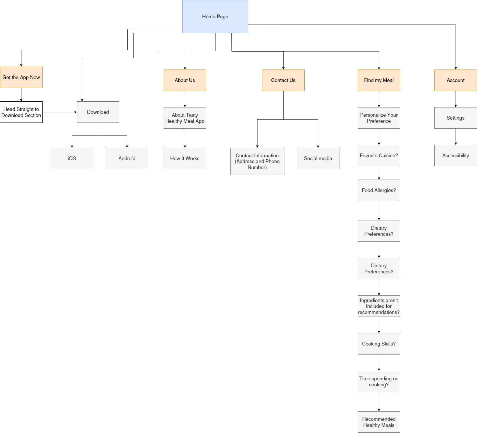
The sitemap for Responsive Design
When making the sitemap for the responsive desktop website, I added two features to the website: one was instructions on how to use the app; the other was to mimic the layout of the app, but with design elements that better fit my responsive grid.
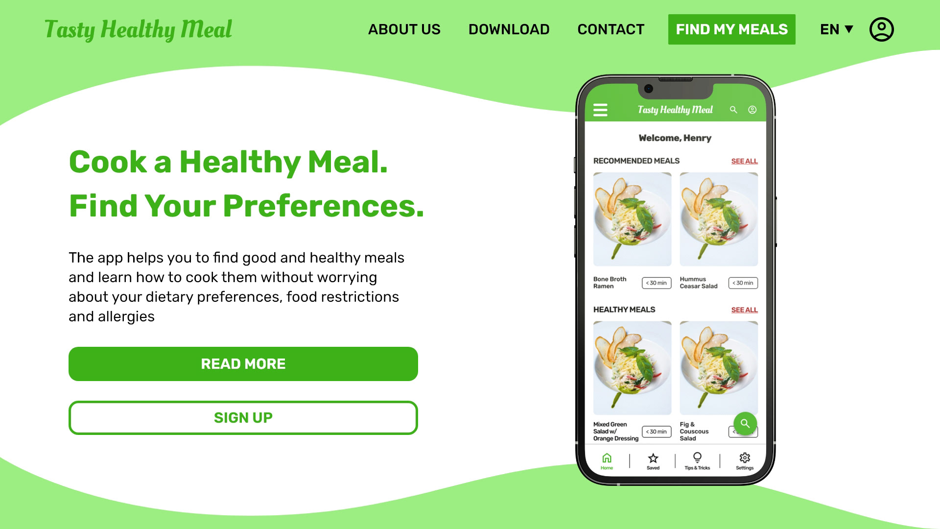
Responsive Design
Following the progress of paper wireframes and low-fidelity prototypes, I worked on the design layouts for the high-fidelity prototypes on the responsive website. These layouts were based on supporting the app, instructing users on how the app works, and helping users search for healthy meals. In addition, I also designed an illustration style for the layout and mock-ups of that.
What I Would Do Differently Next Time
Impact:
• After my edits, most users were very satisfied and said that the app was very straightforward, making it easy to find a recipe based on their preferences. (diets, food allergies, recommendations, etc.)
• In addition, users were happy to see the accessibility changes on “Cooking Mode”, especially the voice recognition feature.
What I Learned:
• How to work under pressure.
• How to take and apply critiques.
• Designing in Figma and Adobe XD at the same time.
What to Improve
1) Look further into how to auto-filter the food restrictions, food allergies, etc., and get more options when users want to customize their “Settings” (style, restrictions, etc.).
2) Work on more prototypes by adding in different navigations (Saved, Tips & Tricks, & Settings). In addition, figure out a way to make a moving-left animation for the CTA button, and scale different frames for the app.
3) Add some photos to other sections like “What Tools are Needed” and Ingredients”, convert the measurements from cups to metrics, and add more screens to the mobile app and responsive website .
4) Keep testing when conducting the usability study! There may be mistakes that peers/participants may unexpectedly see when testing the high-fidelity prototype.
Thank You
You can reach me at
Gmail: henry99.nguyen@gmail.com
LinkedIn: Henry Nguyen | LinkedIn
Behance: Henry Nguyen on Behance