
Project duration:
May 2022 - July 2022
Software using:
Figma
My Role:
Graphic Designer, UX Designer, & User Research
Responsibilities:
User Research, Prototyping, User Testing, & User Interface
About the app
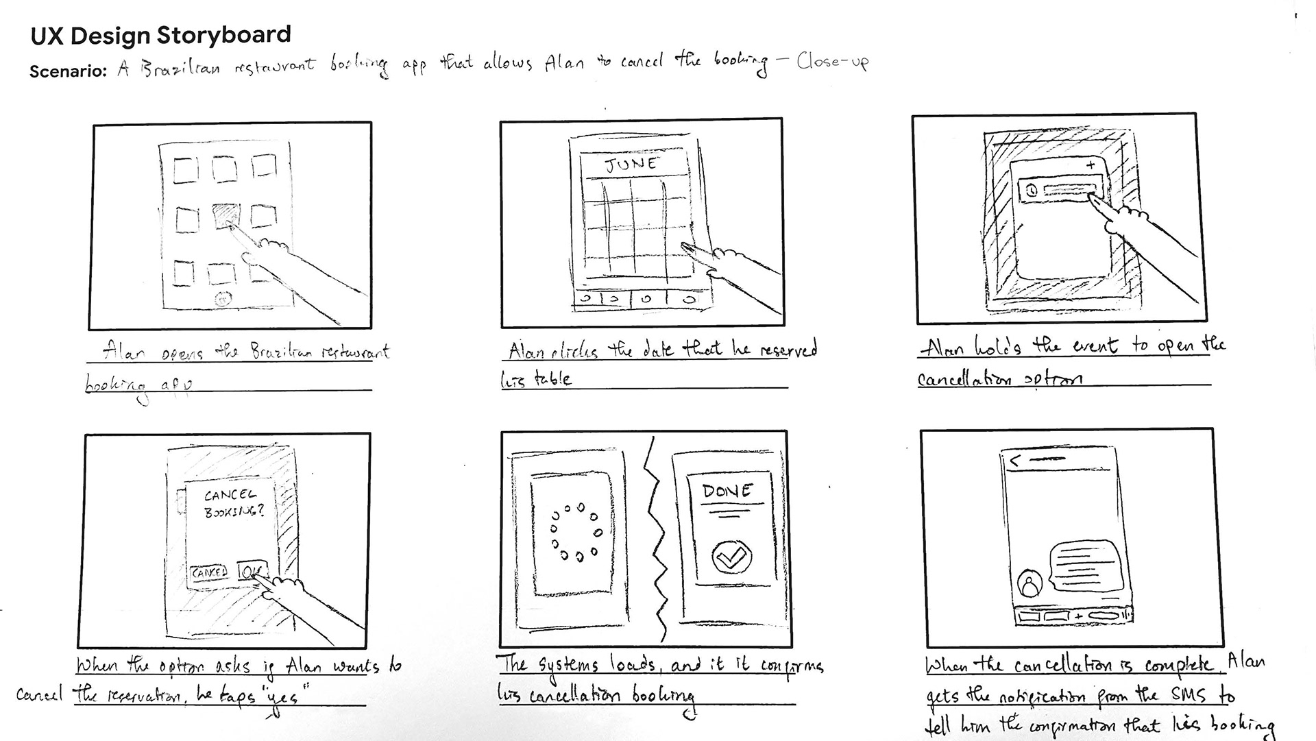
Braz Calendairo Steakhouse is an app designed for customers to book a reservation at the Brazilian steakhouse, Braz Calendairo.
Problem:
1) Customers are having a hard time filling out the reservation form, as it is too time-consuming.
2) Customers cannot cancel their reservation
after booking.
Goal:
1) Let customers fill in the reservation form quickly and effectively without any interruptions or error occurrence.
2) Give customers the ability to cancel their booking reservation through the app.
User Research: Pain Points
1) Time - Users are complaining that it takes too long to book a reservation.
2) Cancel Button - There is no option to cancel the reservation after you book.
3) Troubleshoot Navigation - Users complain about there being too much information on the reservation form.
User Persona & User Journey
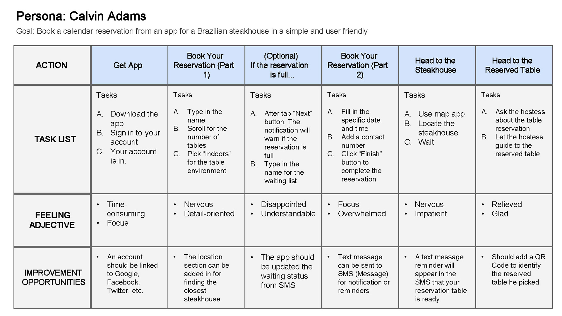

Problem Statement: Calvin would like a calendar booking app with a 3 step-process (stepper states) because he has a hard time filling in the reservation form.
Storyboard & User Flow
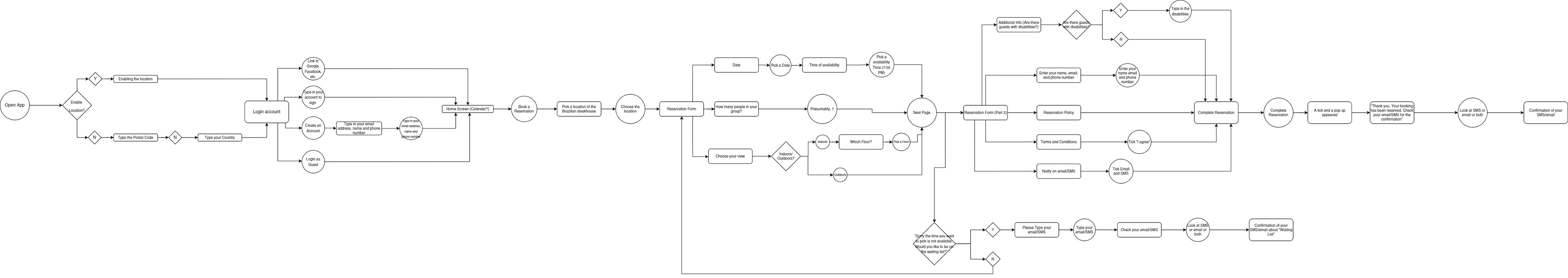
User Flow from the Beginning to the End
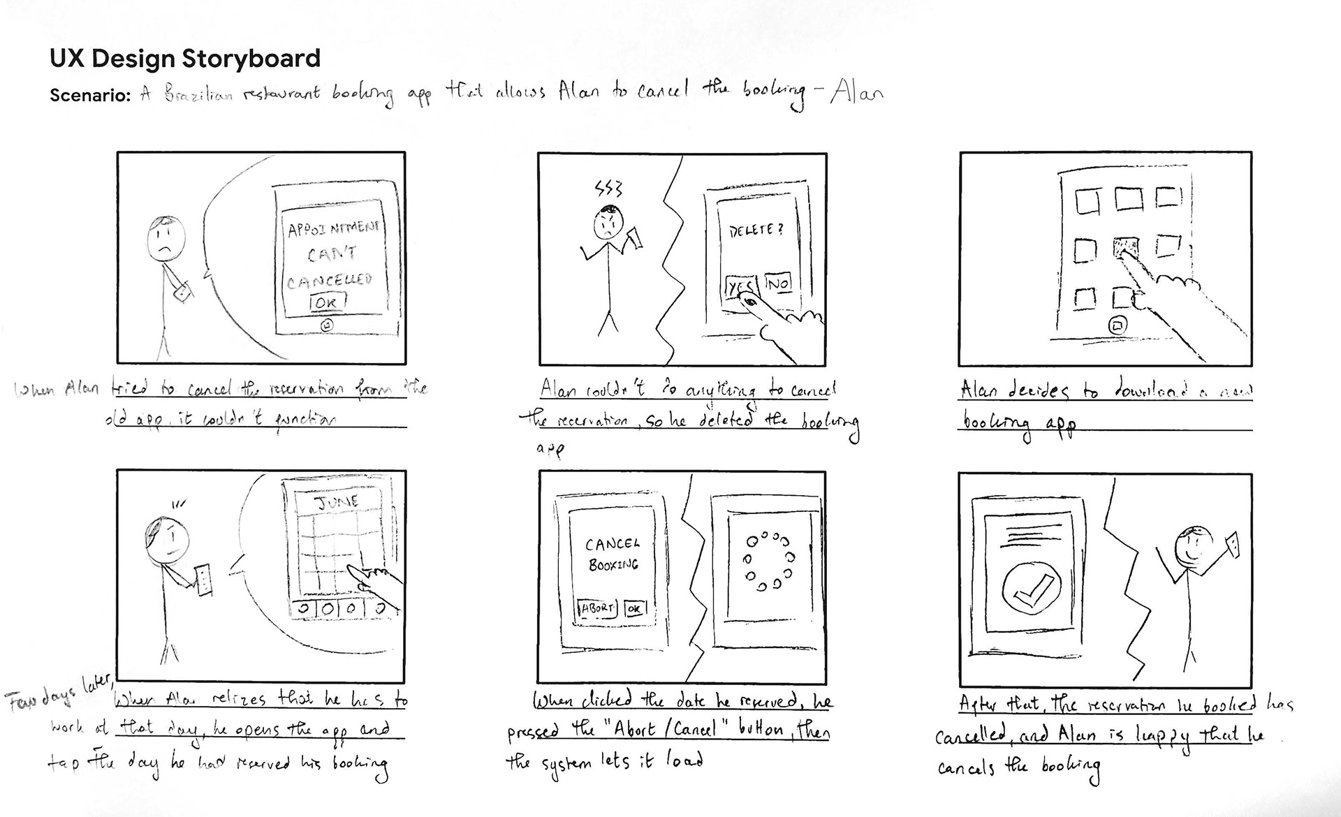
Big Picture Storyboard
Close-up Storyboard
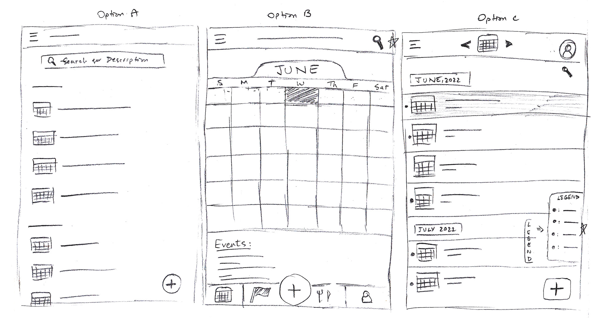
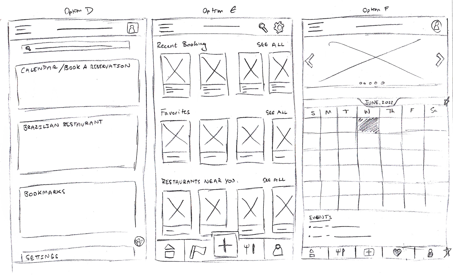
Ideation & Paper Wireframes
After taking the time to look through the user’s pain points, I drew a few paper wireframes on different types of wireframes: Home page variations, and a quick and easy reservation process.
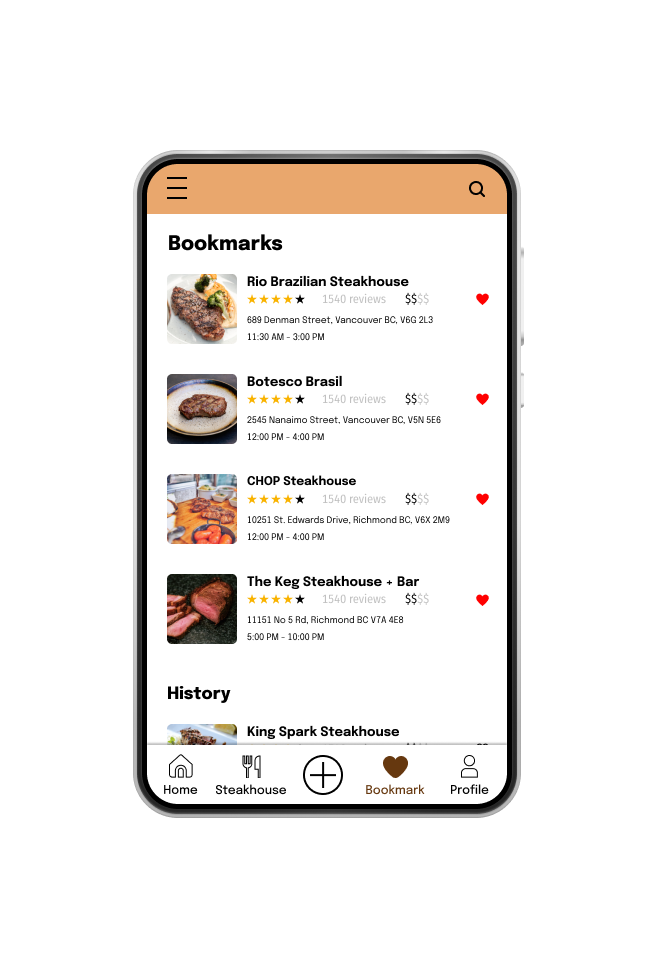
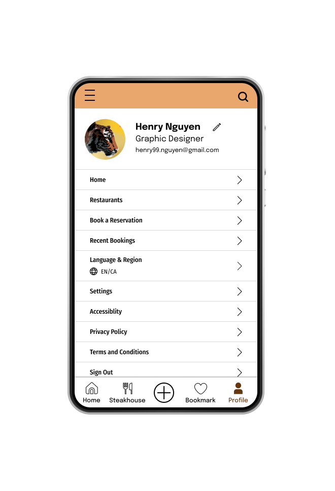
As I continued working on digital wireframes, I started to think about different screens (Home, Steakhouse, Bookmarks, Account, etc.). In addition, I made sure the layout was aligned, clean, and simple, based on feedback and findings from the user research.
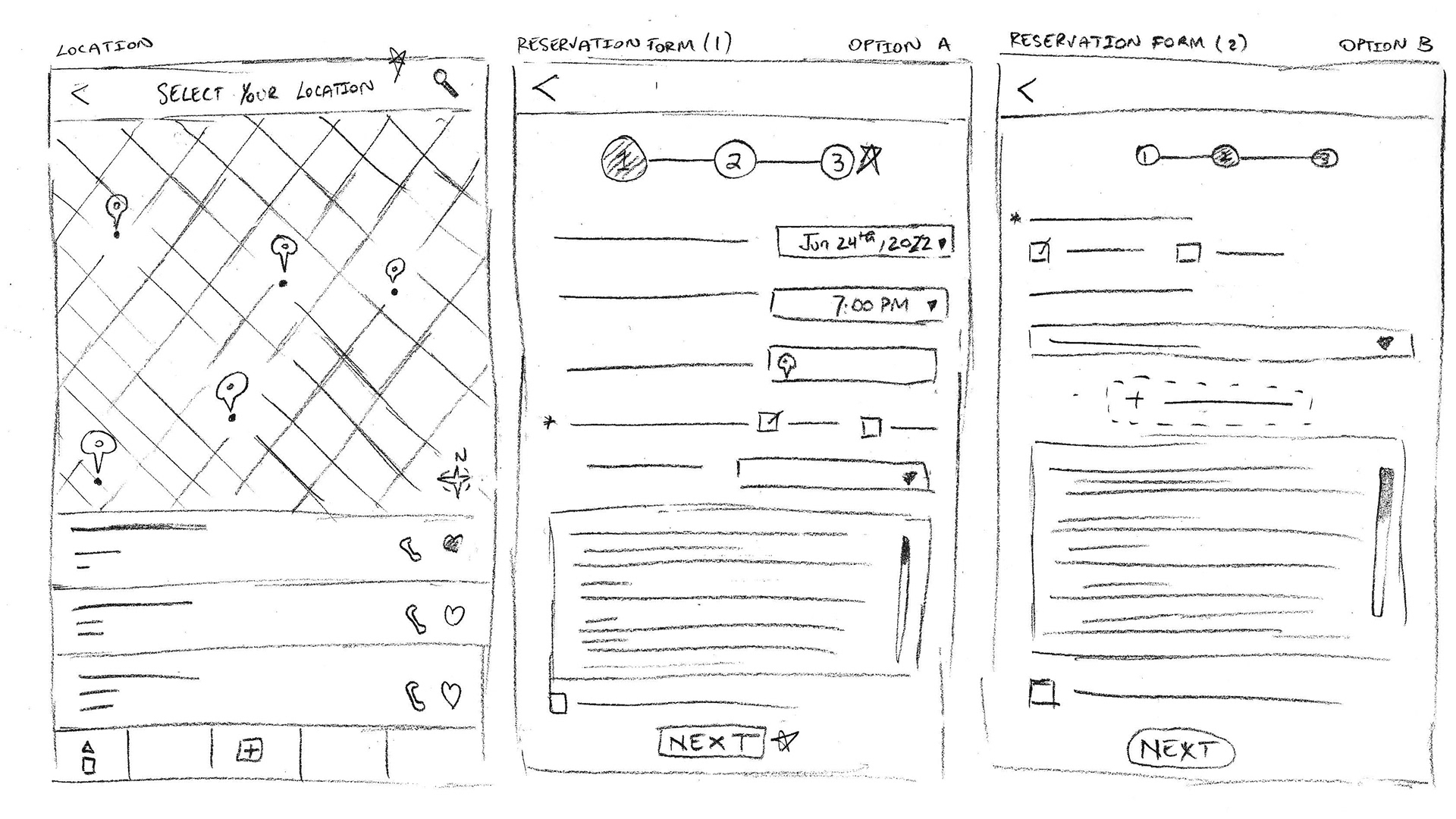
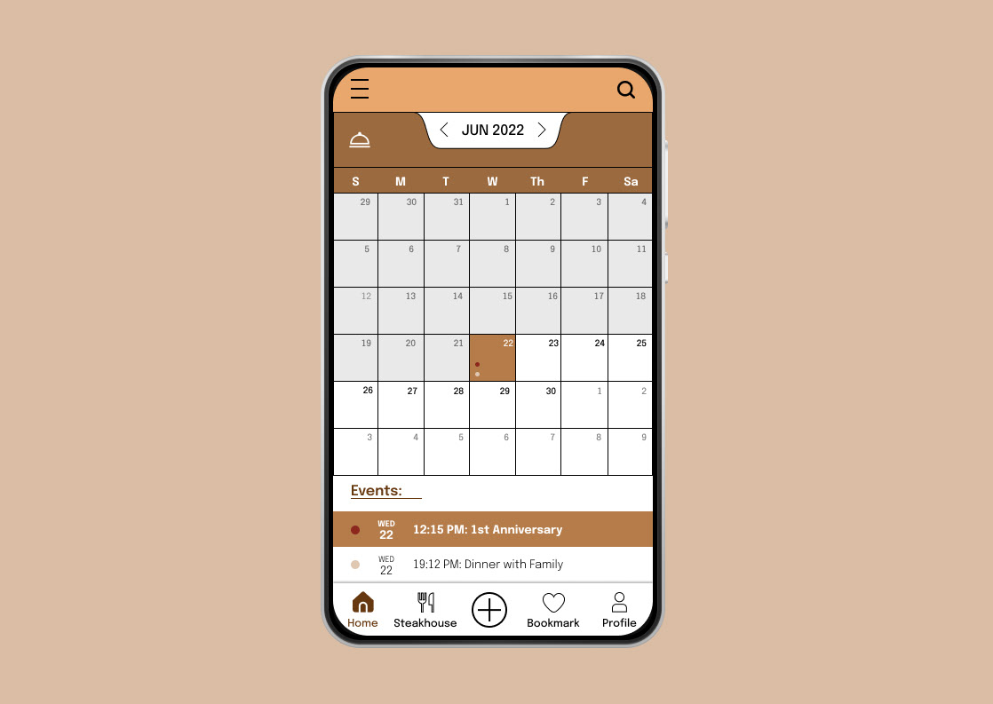
Low-Fidelity Prototypes
The low-fidelity prototype connected the primary user flow of building and booking a reservation.

Insights & Findings
Round 1:
1) The plus icon is hard for users to see and is not recognizable (P1).
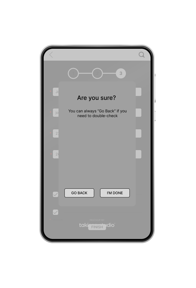
2) The question “Are You Sure?” feels like a deceptive pattern (P0).
3) More descriptive text on icons or without icons to help guide the user (P0).
4) Put the steakhouse as the homepage and then switch to a calendar home page (P1).
Round 2:
1) The visual elements are needed to be fixed from user flow during the user testing (P1).
2) Better readability of the app (P0).
3) Tutorials for navigation (P2).
4) The terms and conditions may not be accessible (P0).
Mockups & Changes
After hearing the critiques and feedbacks, I started to make some changes to the prototypes and designs.
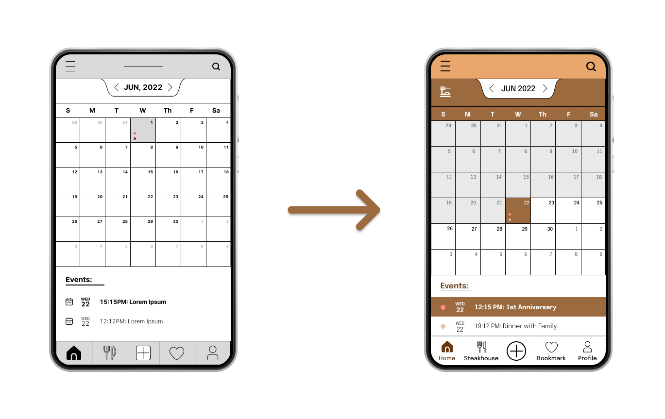
The "Plus Icon" button
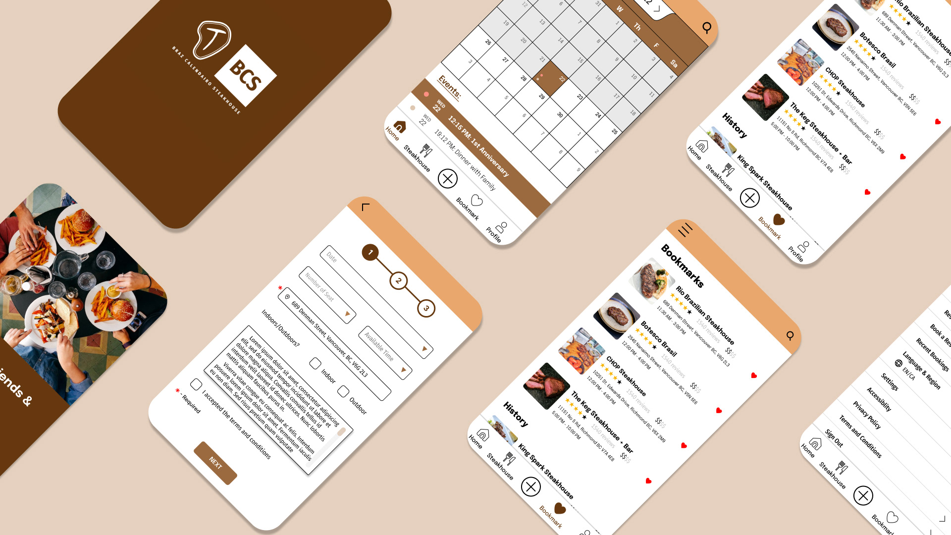
I decided to change the shape of the "Plus" icon into a circle.
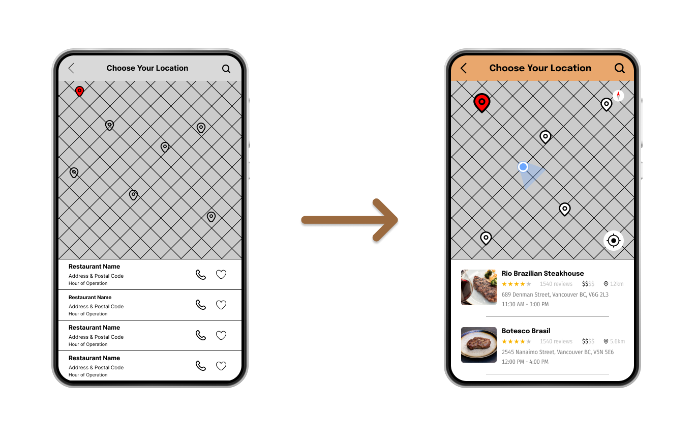
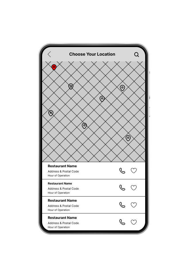
Location Details
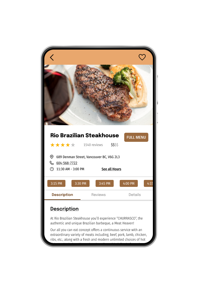
Some participants wanted more details about the restaurant on the app. In order to do that, I stretched some negative spaces to allow for more details (distance between you and the steakhouse, address, hours of operations, rates, etc.)
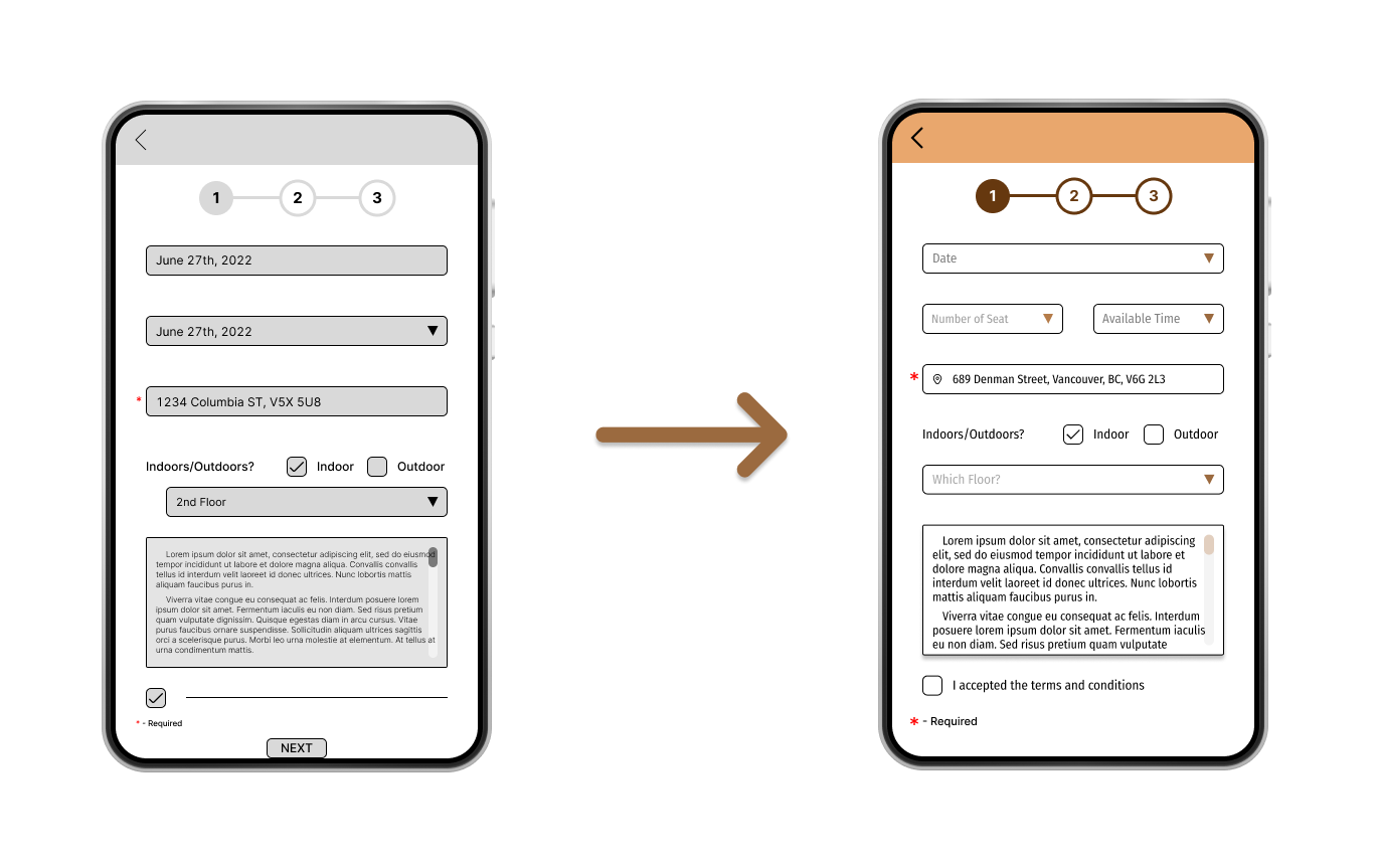
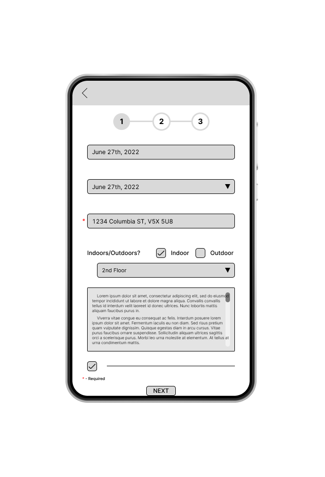
Functions and Actions from Stepper Forms
Most of the participants were not satisfied because the prototype wasn't fully operational. I worked through the forms and choices to make sure that the users could pick their time, place, and other details from the stepper forms.
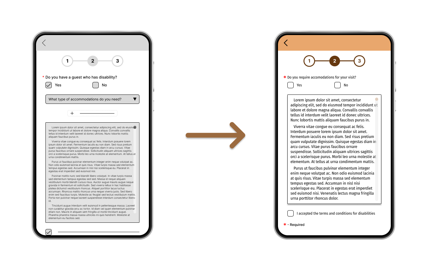
Decision Making
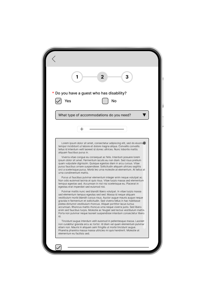
One participant said "If I click "no" when asked if I had a disability, why do I have to accept the terms and conditions for disabilities? It's unnecessary".
After getting this comment, I changed the prototype so that the users can skip the terms and conditions if they don't have any accommodations
or disabilities.
or disabilities.
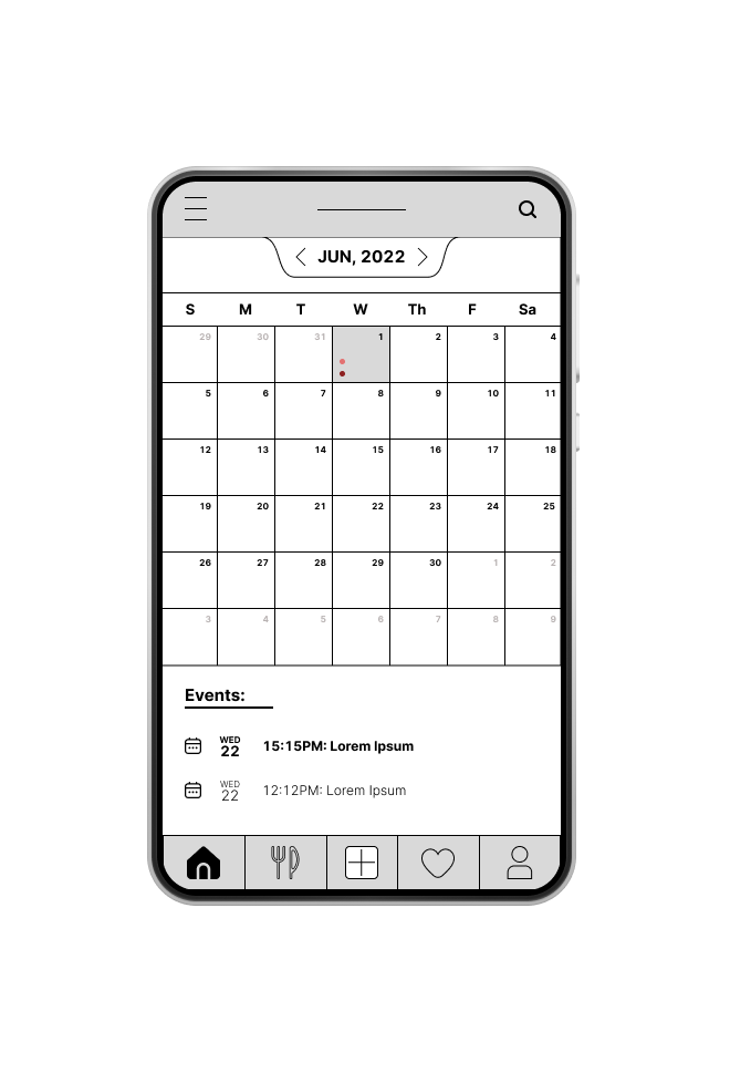
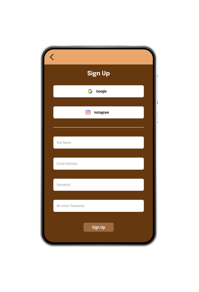
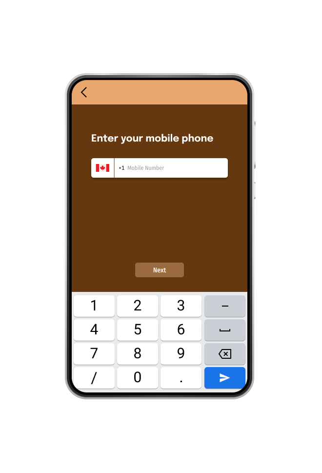
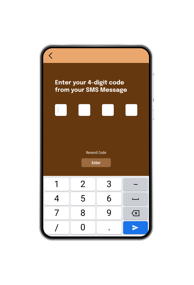
High-Fidelity Prototype
Based on the participant’s feedback, there were more edits I needed to make before customizing my app. After the usability studies, I added components, animations, and additional options to help users navigate the app easily and give them more options to choose from when booking on the app.

Accessibility Considerations
1) More Contents - I added more descriptive content about the Steakhouse calendar app.
2) Better navigation - Made it easier to navigate on the stepper form.
3) Restricted "Terms & Conditions" - I made the terms and conditions more restricted when it comes to people with disabilities and easy access for people who didn't have a disability.
Takeaways
Impact:
• Users/customers can book their reservations easily, and will get a reminder for their upcoming reservation through SMS or Email.
What I learned
• Be flexible
• Work on the details more on Figma
• Learn from the mistakes I’ve received from
the feedback.
• Work on the details more on Figma
• Learn from the mistakes I’ve received from
the feedback.
Next Steps
1) Fix the layouts and text font size. Clean all the components and labels to get proficient details and visual elements. Double-check with the primary user flow for the app before conducting another usability study.
2) Seek more feedback from different people.
3) Test, Test, Test! Always keep testing my design with a bigger subject pool.

Thank You
You can reach me at
Gmail: henry99.nguyen@gmail.com
LinkedIn: Henry Nguyen | LinkedIn
Behance: Henry Nguyen on Behance